

"RAINBOW TREES"
(click on any image for larger version)
This post is in response to a prompt at
Suggested theme COLOR.
Click on the link to add your own response to the
challenge or to view those submitted by others
This post is the eighth in a series explaining how a
particular work of art or a group of works was created.
This post is the eighth in a series explaining how a
particular work of art or a group of works was created.
I created a drawing of trees with colored pencils. I used realistic colors, brown trunks, green leaves. It was okay but not particularly interesting. So I scanned the drawing and started to play with colors. (I no longer have the original drawing ---and in a computer glitch, I lost the original scan.)
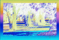
I selected the lightest shade on the original drawing with the magic wand in Photoshop and clicked on "similar" to choose everything that was that shade. I then changed it to a bright yellow. I continued to do this until I had changed the drawing to rainbow colors, and finally chose the darkest areas to change to black.
I then created a border and used the gradient tool to create a gradual change through the colors of the rainbow. I then added more of a pastel look to the result by choosing the rough pastel filter.
For the result, I chose the title "RAINBOW TREES."
But, as usual, I always have to try something else.
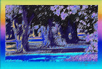 I chose to invert the colors. This changes the blacks to whites, the reds to blues, etc. Usually when I do this, the result looks too pale and washed out for me, mainly because it ends up with a lot of white space. So I selected the white and changed it back to black.
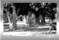
I then chose the chalk and charcoal filter to make a black and white version.
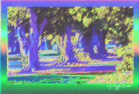
I also chose the solarize filter, which resulted in a very dark image, so I brightened it with the bright/contrast tool and chose to saturate the colors a bit.

 I chose to invert the colors. This changes the blacks to whites, the reds to blues, etc. Usually when I do this, the result looks too pale and washed out for me, mainly because it ends up with a lot of white space. So I selected the white and changed it back to black.
I then chose the chalk and charcoal filter to make a black and white version.

I also chose the solarize filter, which resulted in a very dark image, so I brightened it with the bright/contrast tool and chose to saturate the colors a bit.
I still prefer the original "RAINBOW TREES" but others might like one or more of the other versions better. Color is a matter of taste and choice.
There are many other possibilities for playing with colors. For example, I could choose to change the color balance by increasing the cyan and lessening the red. Or I could adjust the hue/saturation to make the colors more or less intense. I could take one version and place it on top of another, then make it transparent so the colors underneath would show through, mixing with the ones on top. By changing the opacity, the color mix would look more like the top image or more like the bottom one. I could also play with variations, curves or levels options or add filters. There are dozens of options and when one combines two or more of them, the possibilities are nearly endless.
I love playing with images on the computer because in a few minutes, I can try twenty different variations and immediately throw them away if I don't like them. Although I usually create only a few versions (one to five, typically) I could create 25, 100, or 1000 different versions, if I had the time to do that.

(images and text ©2009, C.J. Peiffer)
1 comment:
great trees! I think I like the rainbow trees one best too!
Post a Comment