Showing posts with label "digital art". Show all posts

Wednesday, October 22, 2014

Digital Art - 10/22/14: "Lighthouse in the Lacy Clouds"

NF Photography alternates an Abstract Art prompt with a Digital Art prompt.
Click on the link in the line above to see others or post your own.

11/3/14 addendum:  I chose this image to link to Photo-Heart Connection, as my choice for the image that I worked on (or posted) during October that is closest to my heart.


I was in the Peace Corps in Brazil 1967-1969, but never had the chance to return until 2011. 

I come from stoic German stock ---I'm not demonstrative with emotions.  But somehow, the minute I stepped off the plane in Aracajú and was met by about 30 of my friends and former students, hugs and kisses were not only what I expected, but what I wanted.  Brazilians are so warm and welcoming, even to strangers, but in 2011, I was treated like a long-lost relative. 

It was great to see that nearly all of my former students who lived in a small town in the middle of nowhere and had few prospects for employment, worked hard to pay tuition and room/board to attend a colégio in another city and eventually most went on to university. They became lawyers, doctors, nurses, teachers, professors, meteorologists, ministers of agriculture, bankers, business owners, engineers, social workers, agronomists, and more.  I felt like a proud parent.

When I lived there without electricity, running water, or a sewage system, my neighbors helped me to adapt to the lack of conveniences and treated me like a daughter. Since then, anything Brazilian has always been close to my heart, especially Brazilians.

I started with a photo of a unique lighthouse in Aracajú in Brazil. There was not a cloud in the sky. However, for a photo of an object that is so tall and thin, a large blank sky isn't very interesting.  So I used some photos of sea gulls and lace to create this digital composition. I chose lace for the clouds because in the small town where I lived in Brazil, many older women sat in front of their homes tatting & gossiping.  I still have a few scraps of hand-made lace I purchased from them.
"Lighthouse in the Lacy Clouds"
Original photo,
Aracajú, Sergipe
Brazil
August 2011


Aracajú is one of Brazil's best-kept secrets. Its name was created from a combination of two words: Ara (a genus of macaws) and Cajú (the Portuguese word for the tree that bears cajú fruit and cashew nuts.) In its beautiful park near Atalaia Beach, the sides of benches are painted to resemble macaws, while trash cans are shaped like cajú fruit.

Aracajú is the capital of the small state of Sergipe. Sergipe's innovative health-care system became the blueprint for the national system which covers everyone, even tourists, in Brazil.

Situated on the Atlantic coast 10º south of the equator, Aracajú provides tourists with miles and miles of unspoiled beaches. It has the healthiest lifestyle of all major Brazilian cities and is also one of its safest and has a lower cost of living than other large cities in the country. It doesn't have the spectacular beauty of Rio de Janeiro or Iguaçu Falls, but for a relaxing beach vacation, it cannot be beat. The city has an oceanic aquarium, some interesting old government buildings with ornate architecture, and one can take side trips to several historic cities or to a gorgeous canyon along the São Francisco River.

Aracajú's temperatures hover around 82º (plus or minus a couple of degrees) during the day almost all year long, although it is slightly warmer in the summer months (Dec-Feb south of the equator) and cooler June-Aug. (However, occasionally, such as 2002, the cooler and hotter seasons reverse themselves because it is so close to the equator.) Mar-Aug are the rainiest months while Sept-Feb are drier.

Besides the area's other attributes, Sergipanos are some of the warmest, most-welcoming, helpful, and friendly people in the world. However, you won't find as many Brazilians speaking English at hotels or restaurants as you might find in larger cities, so it's best to take a phrase book with you and perhaps listen to a few Portuguese lessons from your local library so you can at least ask for directions, where to find a restroom, or request your bill at a restaurant.

I lived in a small town in Sergipe's interior during my Peace Corps Days (1967-1969) and visited Aracajú often. At that time it was a rather small city.  Now the metropolitan area has between 800,000 and 900,000 residents.  Because of it's relatively recent expansion, it has many new, modern buildings and conveniences. I spent a week there in 2011 and enjoyed every minute.

*  *  *  *  *  *  *

See hundreds of my photos and artistic creations on my Flickr page

Some of my photos are straight-forward photos. Some have been manipulated into something else. Some are digital creations, which were rendered entirely with Photoshop or other enhancement software. And some are scans of hand-made works of art. A few are a combination of two or more of those.

 If you are interested in a particular type of image or subject matter (such as "art from my photos" or "abstract impressions" or "Brazil") click on "Albums" to the right of my profile image. Then choose the album you want to see.

Otherwise, you will be on my photostream and be able to see everything I've posted, with the most recent first.

Click on any image for a larger view. Below each image is more info about it.  Then click on the arrows to the left & right of a photo to go forward or backward.

My photostream is very eclectic. I love all kinds of art and I like "playing with possibilities" so I am constantly trying something new. I might make 2 or 3 images using a particular technique or style, then move on to something else. Or I might create dozens in a similar style and keep going back to it.

I add photos nearly every day.

Wednesday, October 8, 2014

Digital Art - 10/8/14 "Blue Skies"

NF Photography prompt: Digital Art

I created this abstract quite a while ago so cannot remember every filter I used to make it. But it was actually a very simple idea and if you would want to make something similar, you would probably want to choose your own filters anyway. I recently pulled it up and reworked it slightly.

APOLOGY: Sorry I didn't get back to add comments on many of last week's posts.  I had an emergency medical situation, was in the hospital for a few days and now I'm catching up.   I had already set up automatic posts for several memes up through the next couple of weeks, so I didn't have to create those, but it will take me a few more days to catch up with this week and last week, too.  I'm fine now, just tired.


"BLUE SKIES"

I started by viewing lots of my photos that had large patches of sky
in them. I took horizontal blocks of many photos, finally choosing 12
of them. I made sure some were lighter or darker than others. some
grayer, some bluer, and that some had light or dark areas for variety.
I scaled each to stretch across my new canvas and scrunched or
expanded the height so that the design would be interesting. Although
I can't remember everything I did, I probably used levels to up the
contrast, saturated the colors, and added bas relief in an overlay layer
to create the appearance of texture.  I wanted the result to be rather
minimalistic and monochromatic, yet have enough variety

to make the final image somewhat engaging to look at. 
Composition created from pieces of sky
before enhancing them.
I take lots of sky photos so that, if I end up with
a photo with a washed-out sky, I can replace
it with a better one.  This was the image
after I chose all the individual sections of
sky, scaled and arranged them into my
basic composition, before enhancement.
The idea for my abstract was inspired by minimalist
artists such as Donald Judd who created many
versions of this style of wall sculpture in a variety
of colors.  His is, of course, made of evenly-spaced
geometric pieces, all the same size, all the same color.
I wanted mine to create more interest by changing the
sizes, dimensions, colors, and textures.
Imagine Sol DeWitt's minimalistic creation turned sideways.

PHOTOSHOP TIPS: 
To make your image fill the available space while working on it, you can hit the control key and the number 0. (On a Mac use the command key and the number 0.)
To make your image larger, hit control and the + key (command and + on a Mac.) Each time you do that it will increase in size. (See alternate method below.)
To make your image smaller, hit control and the - (minus) key (command and - on a Mac.) Each time you do that it will decrease in size.

WHEN A SMALLER IMAGE IS USEFUL/NECESSARY:
Let's say that you are working on an image and decide to overlay it with another image that is larger. You go to the Transform>Scale tool, but the edges of the larger image are outside of your work space. By using the instructions above to decrease the size of your image as many times as necessary, you will be able to see the outlines of the larger image and grab the sides or corners to scale it down to the size you want.

I also make my image smaller when I have to straighten it by using the Transform>Rotate tool. 

Sometimes, I like to make my image smaller so I can, in a sense, stand back from it, to get an overall impression of what I've created.

Once you've completed your task, you can use the instructions above to fill the workspace or make your image larger again.

WHEN A LARGER IMAGE IS USEFUL/NECESSARY:
I usually enlarge my image to check for flaws or to see if things I've superimposed are in exactly the right place.  I check one section at a time, then move a little to the right or left, up or down to see the next section. I'm often sure everything is perfect until it has been enlarged several times.

If you are doing things just for fun, it might not be necessary, but when you are creating something for a client, exhibit, shop, or juried show, you don't want it to be filled with flaws.

Alternate enlargement method: use the zoom tool (magnifying glass) from your tool bar. Click on the image with it as many times as necessary.

Wednesday, September 24, 2014

Digital Art - 9/24/14: "Gaillardia Arrangement in Space and Time"

NF Photography alternates an Abstract Art prompt with a Digital Art prompt.
Scroll to the very bottom of this post to see this week's Digital Art composition: "Gaillardia Arrangement in Space and Time."

I just spent several weeks in Portland, Maine.  I took over 1500 photos of the city, the harbor, charming old houses (most built in the 1800's)  You can find some of those (more will be added in the future) and many of my other images on my Flickr page.  View my entire photostream or click on "albums" to the right of my profile image to view a specific set of images. 

There is an album titled "Maine."  The one called "Art from My Photos" contains images that may have been posted for this meme ---or will be posted in the future.

Click on any individual photo for a larger view, then scroll down a little to find more info about that image.

Addendum, 10/4/14: I have chosen the image at the bottom of this post ("Gaillardia Arrangement in Space and Time" as my choice for my Photo/Heart Connection. This is an image that took many hours to complete. I was in new territory (for me) here and had to experiment to figure out how to make my image look as I imagined it. When enough time and effort is put into something and one is pleased with the result, it becomes dear to one's own heart.
Scroll to the bottom to see my result.

This week's Digital art image and where I found my inspiration:
Although most artists want to develop their own style, we are all consciously or unconsciously influenced by other artists. When I see something I find unique or interesting, I might borrow an idea, but I try to change it to become my own.

In July I attended an artist talk and photo exhibit opening at the Carnegie Museum of Art in Pittsburgh. Artist Corey Escoto uses innovative methods to create his photos, but I caught only about 15% of what he said because he didn't project his voice, mumbled, and faced away from the microphone when referring the slides on the screen behind him.

I liked his basic idea, though. He uses old Polaroid technology. He creates black stencils to mask parts of the Polaroid film, exposes the unmasked areas, then uses other stencils to expose or hide additional areas, creating compositions with numerous exposures. He presented some of those framed photos in his exhibit along with sculptures he created using mounted photos to create 3-D houses of cards, to cover the sides of pedestals, and combine photos with an assortment of materials to create 3-D works. I liked some of his work. Other items left me cold.

 Here is a small sampling of Escoto's work, 3 photos and 2 sculptures. (click on any image for a larger view.)


I especially liked how he created images that almost appeared to be mounted photos arranged to create the appearance of 3-D space in the 2nd image above.  I decided to attempt to create something similar myself. I, however, didn't use Escoto's Polaroid technique, but created mine digitally.
I cropped the photo to create a
square image.
"Gaillardia Mix"
Using several photos of the gaillardia in my
garden, I began by creating this digital
composition in Photoshop.
 
"Gaillardia Arrangement in Space and Time"

Finally, I created this digital art composition to give it the appearance
of mounted photos in a 3-D arrangement. In addition to using 
principles

of perspective, I made the images at the back slightly smaller, darker, and 
with less contrast and saturation to add to the appearance of depth.

This took about 5 hours to create.  I had to redo some of the images several
times before I was satisfied.  The one good thing about creating
a symmetrical arrangement was that once I was pleased with an image
on the left, I was able to duplicate and flip it horizontally to add the
same image on the right.

Wednesday, August 27, 2014

Digital Art - 8/27/14 "Dissonant Doors"

NF Photography prompt: Digital Art


For those who think they aren't good at creating abstracts, I have created 3 easy lessons on creating successful abstract designs in any media.  If you are interested, you can find "Lesson 1: Color" by clicking HERE.   Lesson 1 has a link to "Lesson 2: UNITY" which has a link to "Lesson 3: ADDING VARIETY."  
 
"Dissonant Doors"
Although I create dozens of abstract designs from my photos each year, once in a while I come up with something I really love.  I think I like this one because it has more of a painterly feel to it than some of my other digital creations. Of course, I made five or six versions before I came up with this one.  I love digital because I can experiment without wasting materials.
Of course that says nothing about the TIME I waste.
And, of course, I make great use of the undo button.
Keep scrolling down to see the images I used and the steps I took to create this image  in their captions and why I chose this title. (Click on any image for larger views of all images, then click the X in the upper right to return to this page.)

First, I decided to close my eyes and randomly select a folder from my photo files. I landed on "Doors." I previewed the photos there and noticed that I had about 6 photos with red doors and black and/or tan in or around them, so I chose those photos and narrowed my choices to three.

THE TITLE: It just so happened that all of these photos were taken in the quaint historic village of Harmony, PA or nearby. At first I thought of calling it something like Harmony or Harmonious, but I didn't think that fit my final image. So I looked up antonyms of harmony and chose "dissonant."  I decided "Dissonant Doors" fit the image and I liked the double D alliteration.

This building is now a private home
but used to be a bank.
I liked the old-fashioned screen door
on this old house.
An old barn, now used for storage at a golf course.

I chose a part of each photo, scaled it,
moved it around, duplicated and rotated it,
and upped the saturation of the reds,
until I had my basic design.
I merged all my door layers together, then I
used the Photoshop filter gallery (cutout, poster edges,
paint daubs, and underpainting) to give the

image a more abstract ambience.  I also used the
shadows/highlights tool to up the mid-tone contrast.
I then duplicated that layer, changed the mode to overlay,
and used the bas relief filter. 
I still wanted more texture, so I looked through
the royalty-free background textures I have
and decided on this grunge image.
I added it to a new layer and resized it to completely
 cover my existing image. I selected the lightest parts,
feathered the edges and erased them.
Then I moved the opacity to about 50%.

(I could have changed the mode to overlay, instead.)
Using a large soft brush, I erased a few additional parts. 

Finally, I used the shadows/highlights tool to increase
the mid tone contrast on this layer to achieve
the final result at the top of this post.


Wednesday, August 13, 2014

DIgital Art - 8/13/14: "Day Lilies"

NF Photography asks us to post a Digital Art creation.
Next week's prompt will be for an Abstract Photo.

This image is both a Digital Art creation and an Abstract Photo ---or rather several photos combined.

Find Photoshop tips at the bottom of this post.


"Day Lilies"
This image is obviously a representational abstract. I used four photos, taking
parts from each to resize, combine and overlap. I used several different
Photoshop filters and tools to end up with this result.  Some of the original
images are difficult to find because of the overlapping.
After using "accented edges" I noticed that there was a tiny strip of lighter
color around two edges, so I lightened the other two.
(See original photos below.)
All of these were taken in June at
Cranberry Township Community Park in PA.

I used this large Lily twice, once in the lower right,
then I flipped it horizontally and use it in the upper
right, although it is difficult to see there.
These lilies were growing in three huge planters.
When I took theses photos, there were only yellow lilies
and also many buds that hadn't bloomed yet.
Several days after taking photos of yellow lilies,
there were also orange and deep red ones blooming
along with the yellow ones. But I saved those
photos for another project.


I used this as my background. I also copied the large lily
and added it to the top layer so nothing would
overlap it and it would be the focal point
(or center of interest) of my final image.
Notice that I used the "Rule of Thirds" when I took
this photo and also in my final abstract creation.
For anyone who thinks they aren't good at creating abstracts, I have created 3 easy lessons on creating successful abstract designs in any media. If you are interested, you can find "Lesson 1: Color" by clicking HERE. Lesson 1 has a link to "Lesson 2: UNITY" which has a link to "Lesson 3: ADDING VARIETY."

I am a retired art teacher who spent more than thirty years teaching art in public schools ---from kindergarden to community colleges, but mostly in Junior High or Middle Schools.  I also spent two years teaching English as a foreign language in Brazil.

Photoshop tip:
Do you find yourself having to constantly move to the top of the page to choose a smaller or larger brush size?
As long as you want to use the same brush shape and hardness, it's much easier to just hit the open bracket key ([) to the right of the P to make the brush slightly smaller each time you hit the key. Move one key to the right for the close bracket key (]) to gradually make your brush larger.

Wednesday, July 30, 2014

Digital Art - 7/30/14 "Metallica"

NF Photography prompt: Digital Art


For those who think they aren't good at creating abstracts, I have created 3 easy lessons on creating successful abstract designs in any media.  If you are interested, you can find "Lesson 1: Color" by clicking HERE.   Lesson 1 has a link to "Lesson 2: UNITY" which has a link to "Lesson 3: ADDING VARIETY."  

An Oldie, but Goodie
This is something I created a long time ago.  Instead of using a photo, I scanned an object and then manipulated it into an abstract creation.

"METALLICA"

I was ready to box up some old jewelry to see if my nieces would
want it, when I came across earrings that were about 1-inch
square and looked like they were made from thin flat pieces of
tarnished brass that had been scrunched into 3-D folds. On a
whim, I decided to see what would happen if I scanned one. To
my surprise, that dark, tarnished brass came out in shades of
orange, rust, turquoise, green, and purple.  So I manipulated
the shape (copied it, resized it, flipped it, rotated it) added
a shadow and a background.  This piece won a first place
award in the "other" classification at a local art center's
juried exhibit ---the category for art that didn't fit
into drawing, painting, crafts, etc.
 

This represents the scan of one earring. If I still
had the earrings, I'd take a photo so you
could see the original object.

If you have a scanner, try scanning shiny
things like wrinkled aluminum foil,
gold wrapping paper, and jewelry.
Some scans will disappoint, but a few
will surprise and delight you.

Monday, July 14, 2014

Digital Art and Summer of Color - Week of 7/14/14: "IMPRESSION"

NF Photography prompt: Digital Art
NF photo alternates a prompt for a Digital Art creation with a prompt for an Abstract Photo on alternate Wednesdays.


Scroll down for the Summer of Color version:
Week 6's colors are:  Raspberry, Tangerine, Lemon


This is one of the pieces I originally created when I was first learning Photoshop, 25 years ago.  At that time I was experimenting with shapes, textures, gradients, and colors. Photoshop didn't even have layers then, so if I added something and then didn't like it, I could undo only that one step, but after that my change was permanent. (I ended up saving each image after each change and adding a new number at the end of the title.)

In 2001, I recreated it with a more sophisticated version of Photoshop when I needed a gift for a coworker named Mark.  When I'm trying to come up with a title, I often use my computer's thesaurus. When I entered "mark," one of the words that came up was "impression," so that became the title for Mark's gift. At that time I had found some great ink jet paper with a silver sparkly texture, almost like a holograph.  Some images didn't work well on it, but this one looked terrific, so I printed it on the special paper, matted and framed the image for my friend. (Unfortunately the paper is no longer being made, but I had purchased several packages of it and I still have some.)

I also promised Mark that I would never print another one just like his gift. His had only red, black, royal blue and gray in it. The sparkly paper had no ink on it where the image was white.

This image has been reworked numerous times over the years and I reworked it again for this Digital Art prompt and then reworked it again for Summer of Color.  Because I don't remember how many times it was reworked and I lost some of older files when a hard drive crashed, I chose to add a X  and XI for version 10 and 11.

SEE INFO BELOW THE IMAGES FOR A SPECIAL DEAL ON PHOTOSHOP CC, THE LATEST VERSION, PLUS LIGHTROOM.

"Impression X"
Created completely in Photoshop.
"Impression XI"
Summer of Color version: essentially
the same design with color changes, but
I changed a few design elements, too.
Raspberry, Tangerine, & Lemon are the colors
for this final week of this year's S.O.C. meme.

ON SALE:  Photoshop CC and Lightroom for $9.99/month, plus local taxes (regular price is $19.99/month for Photoshop only.) You can set up an automatic monthly payment to a credit card. Requires a one-year commitment. Because it is a subscription, you will receive automatic updates.

To put this in perspective, a new version of Photoshop CS6 costs $699.00, so it would take 5.75 years paying $9.99 each month to match that and wouldn't include automatic updates nor Lightroom. You can try it first with a 30-day free trial.

For more info or to download a trial of each program:
https://creative.adobe.com/plans/photography?trackingid=KMAZI

I can't find info on how long this sale will last. (Last year the sale began the day after Thanksgiving and ended on Dec 31st.) I got mine during last year's sale and was told by the representative that as long as I keep the subscription, the price will not rise. That, of course, may change.

Note: Even though the CC stands for Creative Cloud, you will download the program to your computer, therefore if you are on a computer at work or a library, you will not have access. I think you can add it to 2 devices (desktop computer, laptop, iPad, iPhone) for this price.

You can download it immediately and start to use it right away.

Friday, June 27, 2014

Kitty Par-TAY, Digital Art, Summer of Color - 6/27 to 7/2/14: "Tuxedo Cat"

I am joining the following memes with my "Tuxedo Cat" image:

Kitty Par-TAY ---a place to submit cat art (or other art) each Friday.

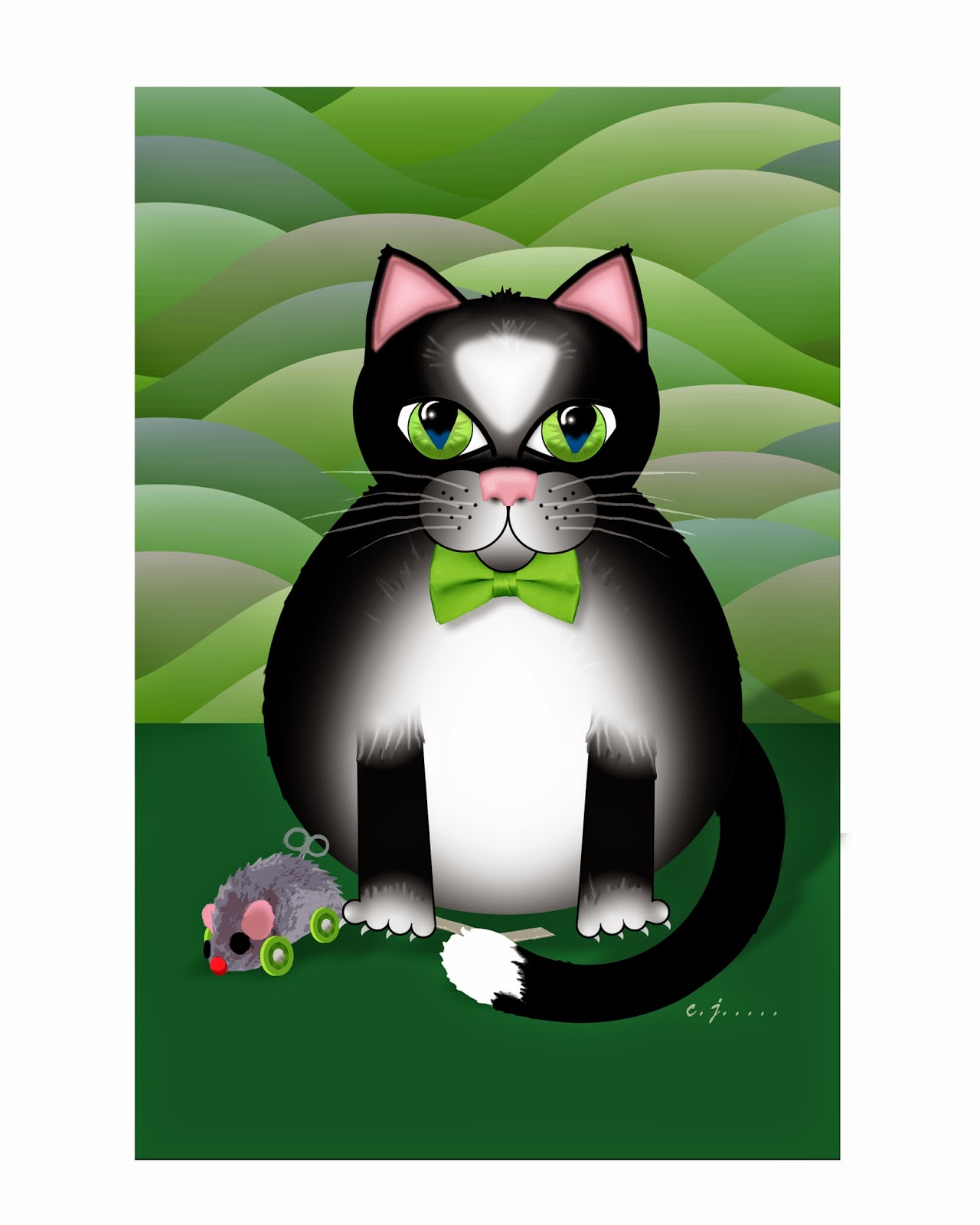
Caterday Art asks you to edit one of your cat photos to make it artistic. I didn't start with a photo. I designed this cat myself to look like folk art and donated cards and prints to a homeless cat organization.

For six weeks this summer, Summer of Color gives us three colors to use in a piece of art work.
The colors for Week 4 are: pink, apple green and dark green.
SCROLL DOWN TO VIEW MY SUMMER OF COLOR VERSION.


NF Photo: DIGITAL ART
NF Photography has been having an Abstract Photo prompt each Wednesday. Beginning on July 2nd the promo will be for a Digital Art creation alternating each week with an Abstract Photo prompt.


Cat Art
Considering that my husband and I have had a number of cats over the years, I haven't produced much cat art.  But recently a friend who volunteers at a non-profit that spays and neuters stray cats asked me to donate to a benefit auction.  I could have donated anything ---it didn't have to be cat-related. However, I decided to design blank cat greeting cards and small matted prints featuring a fat tuxedo cat with a toy mouse.
"Tuxedo Cat in Green"
I wanted these to look like folk art.
I created them digitally using Photoshop.

It took about 20 hours to create this one
and about 15 minutes to change to each
color for other versions. The Summer of
Color took even longer.(See below for the same design
in other colors.)

Click on any image for a larger view of all.

My husband's mother worked for the Humane Society so his family always had a cat and a dog. My family had never had cats, only dogs, but when I bought a house  in 1978, I adopted a cat and soon had three. Two were gray and white, one short and one long-haired. The only female was a gray tabby.

When I met my husband in 1984, he had no pets because he lived in an apartment.

Three years later, on my summer break a tortoise-shell kitten crawled from under my car and came right up to me. We didnt feed her at first, but she stayed in our yard, so then we had four.

Two of them died over the years and then an older calico showed up with an all-white male kitten.  A few weeks later, she had a litter of four, so for a while we had eight total.  We found homes for three kittens and kept one, a long-haired calico female. We had the older calico spayed so we would have no more "surprises." As the years went on, several died and then a tuxedo cat adopted us. (Stray cats must sense that we are suckers for furry faces.) She was actually quite small, not fat like the one in my illustration.  It was sad when we finally lost her. She and my husband had a special bond, but we both miss her terribly.

By that time we were retired and wanted to travel.  Previously a friend took care of our cats when we traveled (not often) and I would walk her dog and feed and play with her cats when she was away.  But she had moved three states away and we had no one to take care of our very-spoiled cats.  So when the tuxedo cat had an inoperable tumor on her back that eventually affected her to the point she could no longer walk, we sent her to the great litter box in the sky and decided not to adopt more cats, at least for a while.

We know that once we are too old and decrepit to travel, we will probably adopt two from an animal shelter.  My husband isn't a people-person, but he absolutely loves animals.  He is a cat magnet. Strange cats go right up to him ---so they certainly must love him back.

SUMMER OF COLOR VERSION
I never saw a greenish cat
I never hope to see one,
But I can surely tell you that,
I'd rather see than be one.
(With apologies to Gelett Burgess who
wrote the famous purple cow poem.)
"Tuxedo Cat in Orange"
"Tuxedo Cat in Turquoise"
Click on any image foe
a larger view of all.
"Tuxedo Cat in Purple"

"Tuxedo Cat in Blue"
I created these in various
colors so I could package
cards in several color
combinations and so
that matted prints could
be selected by buyers to
match room decor.
"Tuxedo Cat in Gold"
"Tuxedo Cat in Red"
"Tuxedo Cat in Pink"
 
Cards are available with a larger face
as in this card.

Cards are available with an entire cat
including mouse toy as in this card.


 If you are interested in buying a set of 4 blank cards or a matted print:
All proceeds to be donated to The Homeless Cat Management Team (I donate my time and materials.)
Your check will be made out to that organization, so it will be tax deductible.

1. Leave a comment that begins with "DO NOT PUBLISH." (I monitor my comments, so I won't publish it.)

If you wish, you may also leave an additional comment about the post that will be published. In that case, please submit 2 comments, one for purchasing items and one for a general comment, not just one.

2. Include your email address and I will get back to you with information on where to send your check.

3. Specify your interest in the items listed below.

Prices include postage within the U.S.  If you want an item shipped elsewhere there will be an additional postage charge.

• 4 blank cards, full body with mouse toy (folded to 5.5" X 8.5") +4 envelopes (assorted colors to be chosen by us from what is available): $7.50

• 4 blank cards, larger face (folded to 5.5" X 8.5") +4 envelopes (assorted colors to be chosen by us from what is available): $7.50

• 5"X 7" matted print, $7.50,  specify color of print you prefer - mat will be either white or black depending on what we have available and will fit a standard 5" X 7" frame

• 8"X 10" matted print, $9.00, specify color of print you prefer - mat will be either white or black depending on what we have available and will fit a standard 8" X 10" frame

Note: Because of the mats, the outside edges of a print will be covered so it will appear to be slightly smaller than what you see above. Prints include the entire cat with mouse toy.

Prints are available in these colors: blue, gold, green, orange, pink, purple, red, turquoise and the special Summer of Color combination of: pink, apple green, and dark green.