Thursday, July 31, 2014

Good Fences - 7/31/14 "Foz do Iguaçu, Brazil"

Good Fences Thursday challenges us to post an image of a fence or gate each week.

 
Today we're heading to Brazil.  (Click on any photo for larger views.)

One can catch a municipal bus in the town of Foz do Iguaçu to take you to the entrance to the National Park to see Iguaçu Falls. There, you catch colorful buses that feature stylized jaquars, alligators and toucans. (There may be other animals, but I saw three buses with those animals on the sides.) However, except for birds, I didn't see any animals, let alone exotic ones ---I'm sure the tourists scare them away.

Once you arrive at the falls, there is a lot of walking on stairs and across wooden or metal walkways to get the best views of the falls. Every place, there are fences or railings to keep tourists safe. The falls seem to go on forever on the Brazilian side of the border.

I have to say the only spectacular thing about these fences is the view from behind them.

Next week, I will post photos from the Argentinean side, where the Spanish spelling of Iguazú is different than the Portuguese Iguaçu.  (I've also seen Iguassu ---which is probably  the English version.)

If you want to see more of my photos of both the Brazilian and Argentinean sides of the falls and view a very short video (less than 30 seconds) that will give you a taste of the enormous roar of the falls from the place where my final photo was taken, you will find those by clicking HERE.


Colorful double-decker buses take tourists from the park entrance
to the actual falls. This one just happened to have a red and
yellow fence (railing?) in front of it. 
Most people get their first view of the falls
from here.  Fences keep tourists from
falling down step hillsides and cliffs into the
rapidly-flowing river below.
A rain poncho was essential to keep from
being soaked by overspray. (Cheap plastic
ones were available.)  It was a cool morning,
so I had thrown a nylon parka into my bag,
without thinking I would need it to stay dry.
There were "bridges" out over the falls
with heavy fences (railings) to keep
us safe.
Closeup of the above bridge.
There are falls behind the bridge, to the right,
and immediately under the bridge, and

plenty more downstream.
This is a still shot from a video I took
on the bridge. The long-haired guy on
the right was a young Japanese
student.  I took pictures of him with
his camera and he did the same for
me.  (He took the photo of me, above,

with my camera.)
There are two levels here to view the falls. This is the upper one,
which is drier than the one below.  Occasionally, on the lower level,
those closest to the railing are suddenly hit with what seems
like 50 tons of water.  (If you click on the link above my photos
you will find a YouTube video of the roaring falls from this location.
It's less than 30 seconds long.)   

Wednesday, July 30, 2014

Digital Art - 7/30/14 "Metallica"

NF Photography prompt: Digital Art


For those who think they aren't good at creating abstracts, I have created 3 easy lessons on creating successful abstract designs in any media.  If you are interested, you can find "Lesson 1: Color" by clicking HERE.   Lesson 1 has a link to "Lesson 2: UNITY" which has a link to "Lesson 3: ADDING VARIETY."  

An Oldie, but Goodie
This is something I created a long time ago.  Instead of using a photo, I scanned an object and then manipulated it into an abstract creation.

"METALLICA"

I was ready to box up some old jewelry to see if my nieces would
want it, when I came across earrings that were about 1-inch
square and looked like they were made from thin flat pieces of
tarnished brass that had been scrunched into 3-D folds. On a
whim, I decided to see what would happen if I scanned one. To
my surprise, that dark, tarnished brass came out in shades of
orange, rust, turquoise, green, and purple.  So I manipulated
the shape (copied it, resized it, flipped it, rotated it) added
a shadow and a background.  This piece won a first place
award in the "other" classification at a local art center's
juried exhibit ---the category for art that didn't fit
into drawing, painting, crafts, etc.
 

This represents the scan of one earring. If I still
had the earrings, I'd take a photo so you
could see the original object.

If you have a scanner, try scanning shiny
things like wrinkled aluminum foil,
gold wrapping paper, and jewelry.
Some scans will disappoint, but a few
will surprise and delight you.

Monday, July 28, 2014

Art Journal52 and Moo-Mania: "Words of Wisdom"

Art Journal52's prompt for Week 30 (beginning 7/27/14) is "Positive Words"

Moo-Mania's prompt for the two weeks ending on 7/29/14 is "Anything Goes"
(this is my first post for this meme)

I read several of Mark Twain's books as a pre-teen and teen ---those featuring Tom Sawyer, Huckleberry Finn, a Connecticut Yankee,The Prince and the Pauper.

But I became a Twain fan (or Twainiac) once I started to read his social commentary. Most of what he wrote is as relevant today as it was when Twain wrote it.

Many think that Twain was born in Missouri (1835) and never left. But after age 17, he lived and worked in Cincinnati, New York City, Washington, Philadelphia, Nevada, California, The Sandwich Islands (Hawaii), Buffalo, Elmira, and Hartford. He traveled up and down the Mississippi River, around the world, and spent many years living in Europe.

In 1867, before he became famous, a newspaper paid him to travel on a six-month cruise to Europe and the Holy Land and send letters back to the paper.  At that time, Europe was supposed to be the center of high culture while many Europeans considered America to be a savage land inhabited by frontiersmen and uneducated bumpkins.

Americans loved Twain's reports of his travels.  Upon his return to America, he compiled his letters and some additional observations into a book. Innocents Abroad became a hit with the public and set him on his way to being the most famous and recognizable man in America by the end of his life in 1910.

Innocents Abroad is filled with Twain's unique observations and much humor ---poking fun at the Europeans and their culture ---but there are also gems of wisdom in it, including the quotation I added to the Artist Trading Card pictured here.

The quotation became especially meaningful to me after living and working in the hinterland of Brazil for several years.  It was then that I realized that any culture in any part of the world is no better or worse than any other, only different.

Friday, July 25, 2014

Black and White Weekend - 7/25/14: "Symmetry"

asks us to post a black and white photo. No spot colors. No sepia. Black and white, only.

The Cathedral of Learning at the University of Pittsburgh, may be the only Gothic-style skyscraper in the world, rising to 42 stories of classrooms and administrative offices.

The first floor, with its high vaulted arches and columns resembles a cathedral. When construction began in the 1920's, Pittsburgh was still basically a mill town. Even though I've lived in this area most of my life, it still amazes me that one can find something this beautiful in Pittsburgh.

As I looked through the photos I have taken there, I found dozens I could have posted.  But there are more weekends to come, so you'll probably be seeing additional images from the Cathedral of Learning.


"Symmetry"
(Note: My photo is NOT a double photo creating a mirror image. This entire photo is what came out of my camera with some cropping to center it and a little contrast adjustment.)

I rather like the idea that an educational building is called the "Cathedral of Learning" because I am devoted to learning.

I was a teacher of English (as a foreign language) in Brazil and an art teacher in public schools in the U.S. for more than 30 years. In addition, I have taught art and writing courses at community colleges, conducted creativity workshops for Western PA Mensa, and have done presentations on Mark Twain and his writing.

I have always been an avid reader and enjoy watching documentaries. I rarely listen to music because I'd rather be learning from an audio book or listening to NPR. (For me, the idea of being able to "read" an audio book while doing something else is downright glorious.)

I have reached the age when I can take free classes (for seniors) at my local community college, although I'm not pursuing another degree. I enroll in one class per semester in a subject that I think will interest me ---and nearly everything does.  I completed an Adobe Illustrator course and others in speech, art history, literature, and digital photography (that wasn't very good, so I plan to take it again with a different instructor.) I plan on taking classes in poetry writing, criminal justice, history, philosophy, graphic design, biology, geography, and more.

If I worship at any cathedral, it is a Cathedral of Learning.

Thursday, July 24, 2014

Good Fences - 7/24/14: "Bearizona"

Good Fences Thursday challenges us to post an image of a fence or gate each week.

 
Today I'm taking you to Williams, Arizona (near Flagstaff.) The famous Route 66 runs through the town and Bearizona is just outside of it.

Bearizona has two parts. One is a drive-through zoo where one has to keep the windows closed and drive slowly so as not to run into bears, buffalo, wild goats, rams, deer or wolves.

 The other part is a walk-through zoo surrounded by a substantial fence with a carved bear guarding the entrance. In that area we saw porcupines, raccoons, more bears, some small wild cats (maybe lynx), foxes and enjoyed a demonstration of birds of prey. There were a few peacocks running about loose. And they had a cage of money-grubbing Ravens. If you slipped the end of a dollar into the cage, one of them would take it and place it into a donation box.

 I have mixed feelings about zoos. I am an animal lover who enjoys seeing live animals that I would never see in the wild, yet I hate to see them locked up. I know that keeping some endangered species in captivity is the only way to preserve them, but I don't think we're short of bears or rams, yet.  These animals seemed to be well cared for and they live in settings as natural as they can be without being in the wild.

Bearizona, near Williams, AZ

Close-up of bear sculpture.
Raven, trained to grab money
and place it in a plexiglas donation box.
Young bears are kept in a
special section inside the
large fenced area.  I think this
fellow is climbing a fake tree.

Wednesday, July 23, 2014

Abstract Photo - 7/23/14: "Screened In" 2 versions

NF Photography prompt: Abstract Photo

"SCREENED IN"

After an evening event at the Carnegie Museum of Art in Pittsburgh,
I noticed a new, large, screened structure behind the museum.  With lights on
inside the structure, which appeared to be a storage area for large equipment,
I liked the designs created by the dark lines, screens, and lights, so I snapped
a few photos.  I wondered why some of the structure (black pieces) were
closer together and why there was a diagonal piece and a very thin one with a
curved corner. But that made the design more interesting than if the black
lines had been the same width, all vertical and horizontal and evenly spaced. 

I decided this image made a great abstract without any
enhancement at all. But, of course, I decided to have a bit of fun with it.


"SCREENED IN #2"
á la Mondrian
Because of the geometric design created by black lines in the original photo,
I decided to make this image resemble a Mondrian painting using primary
colors, black and white.  After making the image more vertical and horizontal
with Photoshop's distort tool (to undistorted it) I created 4 new layers above
the original photo, one for each color and white. On the red, blue, and
yellow layers, I changed the mode from normal to color. I selected
the sections I wanted red and filled them with red and did the
same for blue and yellow.  I left the fourth layer in normal mode
and filled in the sections I wanted to be white, then made the layer
transparent enough to see some of the texture of the screen. Using color
mode doesn't allow very light or very dark areas to accept color, so for the
very lightest spots, I used 3 more normal mode layers for the primary
colors, colored each and then made them transparent so a hint of
color would be visible on those very light areas.

Friday, July 18, 2014

Black and White Weekend - 7/18/14: Conrail Bridge

asks us to post a black and white photo. No spot colors. No sepia. Black and white, only.

Railroad bridge across the Allegheny River
Pittsburgh, PA

Thursday, July 17, 2014

Good Fences - 7/17/14, Photo-Heart Connection - 8/1/14: "Early Evening Farm"

Good Fences Thursday challenges us to post an image of a fence or gate each week.


I've been experimenting with trying to make my images look like HDR (High Dynamic Range) photography. The way HDR is usually done is by using a tripod to take 3 photos, setting one to be slightly overexposed, one underexposed, and one exposed normally. Some cameras can take those three photos and pull the details from the lightest, darkest, and mid-range areas to give you one image with dynamic detail. If your camera can't do that, then some software can do it for you using your 3 photos.

Frankly, I hate carrying a tripod around with me and I just don't have the patience to change settings and take three shots.

Luckily for me, there are ways to "fake" HDR in Photoshop by using only one photo. 
If you want to try it yourself, use the instructions below the photo.
-----------------------------------------------------------------------
Photo-Heart Connection: (addendum added 8/3/14) at the beginning of each new month, we are asked to choose one image we worked on during the previous month that has a special meaning for us, something close to our hearts.

I chose the photo below to represent the month of July for several reasons:  
1. I like the photo of the local farm which I pass frequently.  
2. I like farms, especially dairy farms.  I love the concept of a farm house and barn sitting in the middle of land that is worked by it's occupants, even though it's not the life for me. (Being a night-owl, I want nothing to do with pre-dawn chores.) 
3. I like cows.  They are fairly large creatures, yet are non-violent ones.  They seem to be content with chewing their cuds and making milk in a lackadaisical stupor.  Yet they are smart enough to find their way to the milking parlor and go to their own assigned stalls each day. I love cows' large soulful eyes.

However, my chief reason is:
4. This farm is surrounded by what is rapidly becoming "McMansion Heaven." I like that the dairy farmer has ---at least so far ---resisted selling off his land to create more huge, overpriced homes.  

Have you ever noticed that those communities are all named for things that have been destroyed to build them?   "Indian Meadow" hasn't an Indian nor a meadow in sight.  "Treesdale" used to be a huge apple orchard ---no apple trees survive there.  "Washington Farms" was built on farmland owned by someone named Washington, but crops and pastures are gone and all the Washington's have moved from their land. "Shady Creek" has few trees to keep it shady and the creek was diverted to an underground culvert.  

I used to, work in an industrial park called "Cranberry Woods" in Cranberry Township, PA. Three buildings and their parking lots were surrounded by acres and acres of trees.  I often saw deer and other wildlife from the back windows.  In the six years I worked there, the land was cleared for a hotel, three more office buildings, and accompanying parking lots.  Then a huge corporation cleared twice that much land to build a new complex and "For Lease" signs appeared on remaining wooded land.  Instead of "Cranberry Woods," it should now be called "Cranberry Clear-Cut." Besides being more truthful, the alliteration is almost catchy. 
-----------------------------------------------------------------------
"Early Evening Farm"
Dairy Farm in Western PA
created by using "fake" HDR

After doing the last step (adding Ink Outlines) I erased them from
the sky (I didn't like the tiny black lines there) and then I slightly lightened the sky.
(click on image for larger view)
I prefer this method for creating fake HDR.
Follow these steps in Photoshop to try it yourself:

Note: the slider levels I used worked well on my photo. You can change those to look best on your image.
•Make your normal enhancements to correct levels, color, etc.
•Make a duplicate of that image
•On the duplicate: Go to Image> Adjustments> Shadows/Highlights
•Make sure Preview is checked so you will be able to see the changes on your screen
•Move the slider bars as follows:
        Shadows, Amount: 100%
        Highlights, Amount: 100%
        Midtone Contrast: between 80 and 100%.
        Tonal Width: 30% on both Shadows and Highlights 
Make adjustments up or down as you see fit.
Note: when you move one slider it will look terrible until you move other sliders.
•Hit OK when satisfied, then make more adjustments (lightness, saturation, etc.) if needed. At this point, you can do the optional step or, if you think the effect is "too much" lower the opacity so the layer below it shows through ---adjust until it looks right to you.
Optional step:
•Make a duplicate of that layer while in full 100% opacity.
•Make sure black is your foreground color and white your background color.
•Go to Filter Gallery
•Choose Brush strokes, then Ink Outlines.
You can play with the settings. I set mine at - Stroke length: 4, Dark intensity: 20, Light intensity: 10
•After hitting OK, change the opacity on that layer (I suggest 40 to 60%) and make other adjustments, if needed.  You can also change the opacity on the previous layer, if you want.
If your photo has a sky, you might want to erase the Ink Outlines from it ---they give the sky a lined texture that I don't like. Anything that is supposed to be smooth and light might need to have the lines erased. Or if you don't like the ink outlines, hide or delete that layer, or make it more transparent,  or click on control Z to undo.

Alternate method: In the latest version (Photoshop CC) you can go to Image> Adjustment> HDR toning and play with the possibilities there. (I'm not sure which was the first Photoshop version with this option. If your version doesn't have it, try using the instructions for the method I prefer, above.)

This is what my image looked like on the
layer where I worked with Shadows/Highlights.
You may chose to leave your image like this,
but I wanted to bring out more details and
make it a bit darker, so I went on to create
a layer using Ink Outlines (the image above)

but erased them from the sky.
This is what my original looked like after
a few 
enhancements.  I like this normal

photo image, but I'm always trying to
learn new techniques ---and pass them on.
 

Monday, July 14, 2014

Digital Art and Summer of Color - Week of 7/14/14: "IMPRESSION"

NF Photography prompt: Digital Art
NF photo alternates a prompt for a Digital Art creation with a prompt for an Abstract Photo on alternate Wednesdays.


Scroll down for the Summer of Color version:
Week 6's colors are:  Raspberry, Tangerine, Lemon


This is one of the pieces I originally created when I was first learning Photoshop, 25 years ago.  At that time I was experimenting with shapes, textures, gradients, and colors. Photoshop didn't even have layers then, so if I added something and then didn't like it, I could undo only that one step, but after that my change was permanent. (I ended up saving each image after each change and adding a new number at the end of the title.)

In 2001, I recreated it with a more sophisticated version of Photoshop when I needed a gift for a coworker named Mark.  When I'm trying to come up with a title, I often use my computer's thesaurus. When I entered "mark," one of the words that came up was "impression," so that became the title for Mark's gift. At that time I had found some great ink jet paper with a silver sparkly texture, almost like a holograph.  Some images didn't work well on it, but this one looked terrific, so I printed it on the special paper, matted and framed the image for my friend. (Unfortunately the paper is no longer being made, but I had purchased several packages of it and I still have some.)

I also promised Mark that I would never print another one just like his gift. His had only red, black, royal blue and gray in it. The sparkly paper had no ink on it where the image was white.

This image has been reworked numerous times over the years and I reworked it again for this Digital Art prompt and then reworked it again for Summer of Color.  Because I don't remember how many times it was reworked and I lost some of older files when a hard drive crashed, I chose to add a X  and XI for version 10 and 11.

SEE INFO BELOW THE IMAGES FOR A SPECIAL DEAL ON PHOTOSHOP CC, THE LATEST VERSION, PLUS LIGHTROOM.

"Impression X"
Created completely in Photoshop.
"Impression XI"
Summer of Color version: essentially
the same design with color changes, but
I changed a few design elements, too.
Raspberry, Tangerine, & Lemon are the colors
for this final week of this year's S.O.C. meme.

ON SALE:  Photoshop CC and Lightroom for $9.99/month, plus local taxes (regular price is $19.99/month for Photoshop only.) You can set up an automatic monthly payment to a credit card. Requires a one-year commitment. Because it is a subscription, you will receive automatic updates.

To put this in perspective, a new version of Photoshop CS6 costs $699.00, so it would take 5.75 years paying $9.99 each month to match that and wouldn't include automatic updates nor Lightroom. You can try it first with a 30-day free trial.

For more info or to download a trial of each program:
https://creative.adobe.com/plans/photography?trackingid=KMAZI

I can't find info on how long this sale will last. (Last year the sale began the day after Thanksgiving and ended on Dec 31st.) I got mine during last year's sale and was told by the representative that as long as I keep the subscription, the price will not rise. That, of course, may change.

Note: Even though the CC stands for Creative Cloud, you will download the program to your computer, therefore if you are on a computer at work or a library, you will not have access. I think you can add it to 2 devices (desktop computer, laptop, iPad, iPhone) for this price.

You can download it immediately and start to use it right away.

Friday, July 11, 2014

Weekend in Black & White - 7/11/14: "Fogged Out"

asks us to post a black and white photo. No spot colors. No sepia. Black and white, only.

"Fogged Out"
I went to a hot-air balloon festival, but no morning launches
were possible due to fog.  So, I took photos of the lonely
carnival equipment, instead. 

Thursday, July 10, 2014

Good Fences - 7/10/14 "More of Montour Run"

Good Fences Thursday


Last week I featured the bicycle gate, made of bicycle frames painted bright red. It is along the Montour Trail just south of Pittsburgh. Today I am posting photos of a few of the fences I found along the walking/biking trail and a few other photos from the trail ---without fences.
Last week's photos were of this
bicycle gate.
"Montour Trail"
I moved left to catch the right side
of what is in the image above.
Lots of split-rail fences
along the trail.
More split-rail.
We ran into a few other walkers, but
lots of bikers
More bikers.
Wildflowers along the trail.

Monday, July 7, 2014

Abstract Photo and Summer of Color - Week of 7/7/14: "Barred WIndows"

NF Photography prompt: Abstract Photo
Beginning July 2nd, each week NF photo is alternating a prompt for Digital Art with a prompt for an Abstract Photo. Most of my digital art is also abstract, so many of my creations will work for both.


Scroll down for the Summer of Color version.
Week 5's colors are: Red, Royal Blue, and Light Blue.


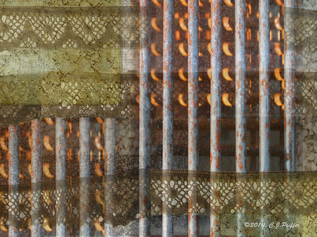
I opened my file that holds photos of textures. The two main elements I chose were my kitchen curtains and a rusty old grate from a local park. Initially I chose a second photo of a different grate, but later decided not to use it.  I purposely chose images that I thought wouldn't go well together, to challenge myself to make them work in one abstract piece.

 I also wanted some background texture, so I chose 3 overall texture photos to add to the background. (I take lots of texture photos so I can use them in artistic pieces.) I made my main elements transparent enough that the textures show through, although in the final piece it is difficult or impossible to determine what they were originally.

"Barred Windows"
The first thing I did was use the distort tool in Photoshop to UN-distort the grate photo
to make the bars vertical. I upped the red saturation a little and created more contrast

with levels (because the photo lost some definition when I made it transparent.)
I basically kept the original colors: gray, ecru, orange, and rust.
There is one complete photo of the curtains (again transparent) but I also duplicated
just the lace and placed it in several locations. I added patches of 3 textures under
everything else.  If you look at the photos below, you will see what they were and be
able to identify them in this image, although I was using them for visual interest so

it doesn't matter what they are. I chose the title "Barred Windows" because the
only reason for bars and curtains to be together seemed to be on windows.
Summer of Color version:
Week 5 colors: Red, Royal Blue, Light Blue
My kitchen curtains and other photos
I used to create the above design.
Grate over storm drain at a local park, with
sunlight brightening some of the bars.
Linoleum
Asphalt parking lot
Small white gravel stones applied to
the outside wall of the municipal
building close to my home.