
Beginning July 2nd, each week NF photo is alternating a prompt for Digital Art with a prompt for an Abstract Photo. Most of my digital art is also abstract, so many of my creations will work for both.

Scroll down for the Summer of Color version.
Week 5's colors are: Red, Royal Blue, and Light Blue.

I opened my file that holds photos of textures. The two main elements I chose were my kitchen curtains and a rusty old grate from a local park. Initially I chose a second photo of a different grate, but later decided not to use it. I purposely chose images that I thought wouldn't go well together, to challenge myself to make them work in one abstract piece.
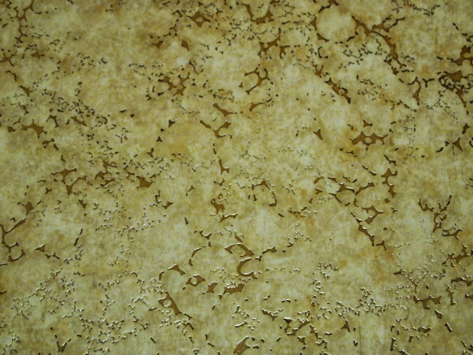
I also wanted some background texture, so I chose 3 overall texture photos to add to the background. (I take lots of texture photos so I can use them in artistic pieces.) I made my main elements transparent enough that the textures show through, although in the final piece it is difficult or impossible to determine what they were originally.
 |
| "Barred Windows" The first thing I did was use the distort tool in Photoshop to UN-distort the grate photo to make the bars vertical. I upped the red saturation a little and created more contrast with levels (because the photo lost some definition when I made it transparent.) I basically kept the original colors: gray, ecru, orange, and rust. There is one complete photo of the curtains (again transparent) but I also duplicated just the lace and placed it in several locations. I added patches of 3 textures under everything else. If you look at the photos below, you will see what they were and be able to identify them in this image, although I was using them for visual interest so it doesn't matter what they are. I chose the title "Barred Windows" because the only reason for bars and curtains to be together seemed to be on windows. |
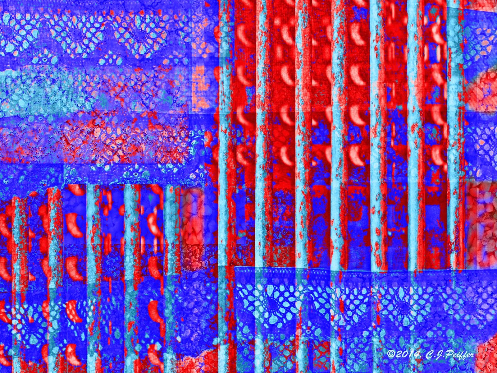 |
| Summer of Color version: Week 5 colors: Red, Royal Blue, Light Blue |
 |
| My kitchen curtains and other photos I used to create the above design. |
 |
| Grate over storm drain at a local park, with sunlight brightening some of the bars. |
 |
| Linoleum |
 |
| Asphalt parking lot |
 |
| Small white gravel stones applied to the outside wall of the municipal building close to my home. |
19 comments:
great digital art! love the SOC piece.
xo
Fabulous! Absolutely fabulous! :D
amazing!
This is stunningly gorgeous. I'm glad you showed all the elements to this piece, because it helped put it in perspective. Again, very, very impressive!!
summer of color version is beautiful.
Nice job CJ! I love seeing your inspirations and how you put them together!
How very interesting the way you used the curtains for your creation. I would say that is very creative. Great job with this weeks colors!:)
There is such stark contrast between the harshness of the bars and the delicacy of the lace. It makes an interesting, even tantalizing, whole. Very nice CJ ...
Andrea @ From the Sol
what a fantastic abstract piece...I love all of the different images that you used and they work so well in the colours for SOC too!
Love what you have made! Valerie
Terrific results...Your process is interesting as well. Thanks for sharing!
Wow this is amazing and your SOC colours really POP! I admire how you put these disparate images together to form something completely new and unexpected.
amazing what you can digitally create - the colors are wonderful, love it
very nice digital art!
the two photos combined and given a "makeover" made a very pleasent abstract. :)
WOW! So creative and inspiring! I love what you did with these colors!!!
It's so interesting to read how you constructed your photo-edited piece from the five photos. I've come from SOC but is it OK to say I like the non-SOC coloured one best, it's got such a mysterious look about it.
Oh this is so cool! I love the SOC one, the colours are just crazy but in a good way!
Post a Comment