"FIRE & ICE"
(Click on images for larger versions.)
My series "The Creative Process" explains how a
particular piece of art or a group of works were created.
This post is, in part, a response to
Click on the link to add your own
creative endeavor, or see what others have posted.
 The Photo
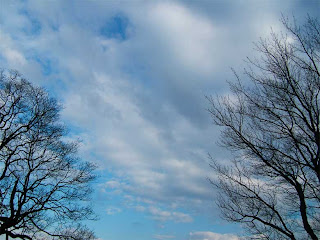
 Occasionally I submit photos to Sky Watch Fridays, so I have been paying attention to skies and taking photos of them for several months. One day when I was walking, my lower back was bothering me, so I stopped to lean back against a fence beside the walking trail. In front of me were two trees with a beautiful sky between them. I snapped a few pictures.
Now, when I walk on that trail, I always stop at that spot to take additional photos, planning to create a future post for Sky Watch Friday marking how the sky and the trees change through the seasons.
One of the earlier photos I took was when the tree branches were still bare during the winter.
The Process
When I started to work with this photo, I wasn't sure where I was going with it. I just experimented a bit and ended up with something surprising. I had thought I might just enhance the blue sky and perhaps give it the look of a pastel drawing.
 1. In Photoshop, I selected a branch with the magic wand, then chose "similar". In this way, I was able to select all of the branches and copy them to a separate layer.
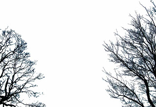
2. By selecting the branches and choosing "inverse" I was able to select everything except the branches (in this case, the sky) and put it on a separate layer. I "turned off" the layer with the branches & allowed the white background layer to be visible in the holes where the branches would be. I also played with the color balance and saturation on the sky.
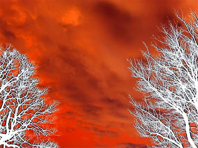
3. Simply to see how it would look, I inverted the color of the sky. It became an orange shade, which I again enhanced with more red and stronger saturation. By inverting the colors, the white of the clouds had also turned dark. It reminded me of videos I have seen of massive fires, with the sly filled with billowing orange and black smoke.
I liked this, the white tree branches looking like they were covered with snow or ice and the sky resembling fire. Immediately I thought of the title "Fire & Ice." At this point, the white branches were really still the white background layer showing through, but the plain white trees looked too flat to me.
4. So I took the black tree outlines and made 2 more copies and changed one to white. I had three layers of black tree branches, plus one white.
I placed a copy of the black tree branches on three separate layers over the orange sky and then placed the white tree branches on top.
On each of the three layers with black branches, I nudged one slightly left, one slightly right and one slightly up, to make it look like black outlines around the white.
The image at the top of this post is my final completed "Fire & Ice" Several years ago I created an abstract work called "Fire and Ice." Since I had used "and" in that one, I used an "&" in this one.
Variations
As usual, I always have some other variations. These may have been steps along the way that I sort of liked, but rejected for the final product. However, because different people have different tastes, some may like these better than my final choice.
Variation 1. I cloned parts of the trees to create a third tree in the middle. Also, I put the black over the white in this one. My only objection to this is that most of the sky, which I think looks dramatic in my final pick, is hidden. I do like the black over the white, but because I liked the title "Fire & Ice" I thought the white over black worked better, creating more contrast between the hot orange and cold white.
Variations 2 & 3: These are exactly like the one I chose except that I did not invert the sky colors. Instead, I enhanced the sky with some magenta (left) and cyan (right).


5 comments:
Now for the real question. How long did the process take from time of loading the original snapshot to achieving the final art? As an artistically challenged techie, I always wonder how long the process takes an experienced user.
I loved all the versions!!! These would make a great collection ... with all the variation next to each other in black frames. Really cool looking.
Dan ---that's a good question.
My answer is: I don't know. When I work on something like this, I get mesmerized and lose all track of time. I'm also a night owl, so I often stay up until 6 am when I don't have to be anywhere. Therefore, I don't watch the clock. Sometimes I work on something, then save it and get back to it days or weeks later.
If I had to guess, I would say it took me 2-3 hours, but that is just a guess. A lot of that time is experimenting and either keeping or rejecting the results. What I finally used wasn't very complicated. If I knew from the beginning that is what I wanted to do, with no side trips, it might have taken only 45 minutes or so.
See my post:
http://proartz.blogspot.com/2009/01/creative-process-art-2.html
It shows a very complicated and time-consuming digital remake of the Mona Lisa. See the section on "The Time" for my guess as to how long it took me to do that one.
Great photos. Thanks for stopping by.
o my, i just love this. love the tutorial and the end result. brava!!
Post a Comment