NF Photography prompt: Digital Art
For those who think they aren't good at creating abstracts, I have created 3 easy lessons on creating successful abstract designs in any media. If you are interested, you can find "Lesson 1: Color" by clicking HERE. Lesson 1 has a link to "Lesson 2: UNITY" which has a link to "Lesson 3: ADDING VARIETY."
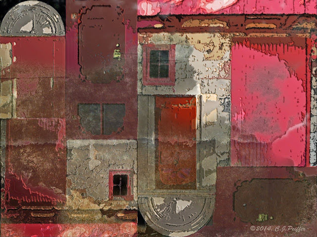 |
"Dissonant Doors"
Although I create dozens of abstract designs from my photos each year, once in a while I come up with something I really love. I think I like this one because it has more of a painterly feel to it than some of my other digital creations. Of course, I made five or six versions before I came up with this one. I love digital because I can experiment without wasting materials.
Of course that says nothing about the TIME I waste.
And, of course, I make great use of the undo button. |
Keep scrolling down to see the images I used and the steps I took to create this image in their captions and why I chose this title.
(Click on any image for larger views of all images, then click the X in the upper right to return to this page.)
First, I decided to close my eyes and randomly select a folder from my photo files. I landed on "Doors." I previewed the photos there and noticed that I had about 6 photos with red doors and black and/or tan in or around them, so I chose those photos and narrowed my choices to three.
THE TITLE: It just so happened that all of these photos were taken in the quaint historic village of Harmony, PA or nearby. At first I thought of calling it something like Harmony or Harmonious, but I didn't think that fit my final image. So I looked up antonyms of harmony and chose "dissonant." I decided "Dissonant Doors" fit the image and I liked the double D alliteration.
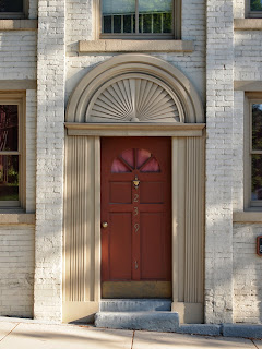 |
This building is now a private home
but used to be a bank. |
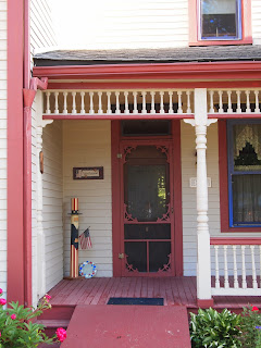 |
I liked the old-fashioned screen door
on this old house. |
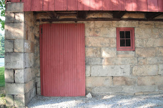 |
| An old barn, now used for storage at a golf course. |
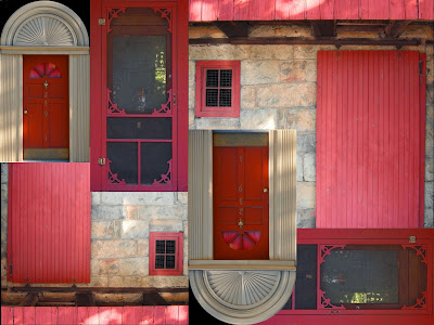 |
I chose a part of each photo, scaled it,
moved it around, duplicated and rotated it,
and upped the saturation of the reds,
until I had my basic design. |
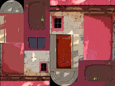 |
I merged all my door layers together, then I
used the Photoshop filter gallery (cutout, poster edges,
paint daubs, and underpainting) to give the
image a more abstract ambience. I also used the
shadows/highlights tool to up the mid-tone contrast.
I then duplicated that layer, changed the mode to overlay,
and used the bas relief filter. |
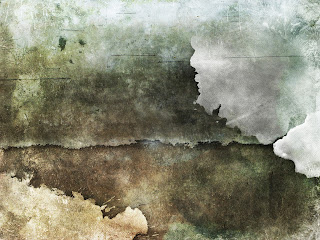 |
I still wanted more texture, so I looked through
the royalty-free background textures I have
and decided on this grunge image.
I added it to a new layer and resized it to completely
cover my existing image. I selected the lightest parts,
feathered the edges and erased them.
Then I moved the opacity to about 50%.
(I could have changed the mode to overlay, instead.)
Using a large soft brush, I erased a few additional parts.
Finally, I used the shadows/highlights tool to increase
the mid tone contrast on this layer to achieve
the final result at the top of this post. |


3 comments:
Wow! That's wonderful!
I do like the way you think when you're making your art.
The doors made me smile.
Have a nice evening
Mormor
Great piece! Thanks for showing the steps along the way.
Post a Comment