Scroll to the very bottom of this post to see this week's Digital Art composition: "Gaillardia Arrangement in Space and Time."
I just spent several weeks in Portland, Maine. I took over 1500 photos of the city, the harbor, charming old houses (most built in the 1800's) You can find some of those (more will be added in the future) and many of my other images on my Flickr page. View my entire photostream or click on "albums" to the right of my profile image to view a specific set of images.
There is an album titled "Maine." The one called "Art from My Photos" contains images that may have been posted for this meme ---or will be posted in the future.
Click on any individual photo for a larger view, then scroll down a little to find more info about that image.
Addendum, 10/4/14: I have chosen the image at the bottom of this post ("Gaillardia Arrangement in Space and Time" as my choice for my Photo/Heart Connection. This is an image that took many hours to complete. I was in new territory (for me) here and had to experiment to figure out how to make my image look as I imagined it. When enough time and effort is put into something and one is pleased with the result, it becomes dear to one's own heart.
Scroll to the bottom to see my result.
This week's Digital art image and where I found my inspiration:
Although most artists want to develop their own style, we are all consciously or unconsciously influenced by other artists. When I see something I find unique or interesting, I might borrow an idea, but I try to change it to become my own.
In July I attended an artist talk and photo exhibit opening at the Carnegie Museum of Art in Pittsburgh. Artist Corey Escoto uses innovative methods to create his photos, but I caught only about 15% of what he said because he didn't project his voice, mumbled, and faced away from the microphone when referring the slides on the screen behind him.
I liked his basic idea, though. He uses old Polaroid technology. He creates black stencils to mask parts of the Polaroid film, exposes the unmasked areas, then uses other stencils to expose or hide additional areas, creating compositions with numerous exposures. He presented some of those framed photos in his exhibit along with sculptures he created using mounted photos to create 3-D houses of cards, to cover the sides of pedestals, and combine photos with an assortment of materials to create 3-D works. I liked some of his work. Other items left me cold.
Here is a small sampling of Escoto's work, 3 photos and 2 sculptures. (click on any image for a larger view.)
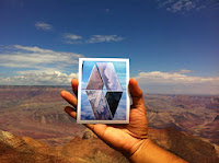
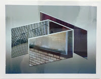
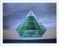
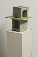
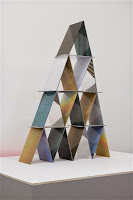
I especially liked how he created images that almost appeared to be mounted photos arranged to create the appearance of 3-D space in the 2nd image above. I decided to attempt to create something similar myself. I, however, didn't use Escoto's Polaroid technique, but created mine digitally.
 |
| I cropped the photo to create a square image. |
 |
| "Gaillardia Mix" Using several photos of the gaillardia in my garden, I began by creating this digital composition in Photoshop. |


7 comments:
I am going to assume you are working with more powerful digital software than anything I have because I don't think I could get the perspective to look so real. I can't even imagine how you were able to do this, but you did and it is amazing. Have you ever posted on Lorik Arts Geometric Friday? She is gone for two weeks (this Friday would be the seccond week), but this is perfect for what she is looking for. I love this CJ ...
Andrea @ From the Sol
OMG, CJ, I figured it out on my simple PSE and what an awesome technique ... Thank you for sharing. I will always give you credit if I use it in a post :)
Andrea @ From the Sol
I agree with you, we are all consciously or unconsciously influenced by other artists.
Thanks for sharing!
Andrea, I use Photoshop CC, but I could have accomplished the same thing with any version of PS I've had over the years (PS6, PSC3) You may or may not know that I was an art teacher for a zillion year, so I used the principals of perspective drawing that I had learned and taught to create my basic image.
I always create new layers for each step in Photoshop, so if I ever decide to do this again, I can use the basic layout with different photos. I could even turn the layout upside-down.
I completed another one and started several other layouts before I went on vacation, but haven't gotten back to them.
You don't need to credit me ---just change the basic layout ---and, of course, you will be using your own photos, so you will be making it into your own design.
Not long after I created this image, I saw some that an guy posted on Flickr that seem to use the same general idea. (https://www.flickr.com/photos/mehrz/14804089893/in/photostream/)
He also creates a lot of images that look like they are created from strips of woven paper.
He uses a lot of images of ancient art or even the art of the impressionists ---which are in the public domain, but sometimes he uses images of film stars that probably are not.
Of course Warhol got away with doing that, but I bet he'd be sued today.
Very cool...your patience to detail is admmirable♪ http://lauriekazmierczak.com/koi-pond-lily-pad/
Great processing! I love the original shot, too.
very cool...definitely have to try this.
I am not sure how I missed this post and didn't find it till now!
Post a Comment