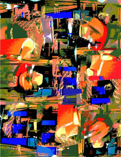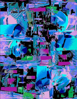

"Cabin Fever"
Versions 1 & 2
(©2009, C.J.Peiffer)
This post is the fifth in a series explaining how a
particular work of art or a group of works was created.
This post is in response to a challenge at
Click on the link to add your own response to the
challenge or to view those submitted by others
CHANGING A REALISTC IMAGE INTO AN ABSTRACT DESIGN
There are many ways to create an abstract design. One can, of course, start with a clean canvas or sheet of paper and create something from nothing. Or one can start from a real object, then change it until it no longer looks like anything real.
For this particular design, I started with a photograph and changed it in many steps using Photoshop. I could have come up with something similar with paint and brush.
I was reading the previous day's mail over breakfast one day. On the table was a catalog for a cruise that I couldn't afford and which I intended to throw away. Later, when I returned to the table, I saw a photograph in the catalog up-side-down, and at first, thought it was an abstract painting. I had been thinking about posting a "Creative Process" post about making abstract designs, so I thought I would use that photo to make a nonobjective abstract ---that is, a design in which there are no recognizable objects.
In a nonobjective design, the viewer might imagine that a design resembles something, but the artist had no intention of creating a recognizable image.
THE PROCESS
The first thing I did was copy and paste the photograph several times, turning it to show different points of view, overlapping the images on top of each other to fill the available space. What this does is it repeats shapes and colors, making the design look unified, yet because the shapes and colors are sideways or up-side down, the design achieves some variety to make it interesting.
I liked the royal blues in the original photograph, so I selected anything that was that blue shade, copied and and pasted it on top of the photo arrangement.
I also saturated the colors, made them more intense.
Then I tried to make the design look like it was no longer a photo by using filters to make parts look like cut out pieces of paper and giving it the appearance of rough pastels. Even after doing some of this, the fruit basket was still recognizable, so I blurred those parts.
Next, I lightened some of the colors, created more contrast, and then saturated them even more than I had done before.
I thought the design needed more contrast, so I chose parts that were a dark brown and made them black. Then I chose some parts that were olive green and made them a brighter shade of dark green.
THE TIME
This sounds like it took only a few short steps, but I experimented with many different changes, often rejecting them and trying something else. With Photoshop, one can add things to new layers, or copy a layer and try a certain effect. If I don't like what I tried, I can undo it, or I can delete that layer and try something else. It probably took me about 2 hours to decide what I liked and didn't like before I settled on my final design.
VARIATIONS
At this point, I liked the design, but I wanted to try some other possibilities, so I took the resulting design (a larger version is at the very top left of this post) and chose to invert the colors. That meant that black became white, red became light blue, royal blue became yellow. I sort of liked the result, but it seemed pale and washed out.
I chose all the white parts and made them black again. I didn't like the yellow, so I changed it to magenta and I made the orange parts green.
Now I had two versions of the same design in two different color combinations. (See very top of post.) I could, of course, create many more different variations, if I chose to do so.
If one looks at the original photograph and the final designs side-by-side, one can still see some similarities. But without the original photo, I doubt that anyone would recognize or guess what was in the original photo.
When I taught school, before we had computers, I had my 8th grade students draw an ordinary object, such as a pencil sharpener, a book, or a a bottle of paint. Then using carbon paper, they copied the shapes and lines several times, each time distorting the object a little. One can achieve the same results by tracing on another piece of paper while holding it on top of a drawing with the help of a light table or a window. On the fifth or sixth change, students used colored pencils to color the result in bright colors that had nothing to do with the original object. They were metamorphosing the objects from a realistic line drawing to a nonobjective abstract in several steps.
THE TITLE
Although the original photo has been changed so much, no one would recognize it, it was originally the image of a ship's cabin, so I called my design "Cabin Fever."
(©2009, C.J. Peiffer)


1 comment:
This was so cool! I love learning about the process and I love seeing it evolve. I love the end result. And as a cruise devotee, I can see that that cabin is only for the very wealthy! This was so cool. I am going to link to this post soon so others can enjoy it!
Post a Comment