Showing posts with label photo. Show all posts

Wednesday, October 15, 2014

Abstract Photo - 10/15/14 - "Ruined"

NF Photography prompt: Abstract Photo

"Ruined"
this image was decayed so much that it was

almost an abstract by itself. I only
enhanced it to bring out textures
and add some color.


I like taking photos of old, run-down, or even decaying things. Unlike items that are shiny and new, these items have "character," even when crumbling to ruin.

One morning I set out to take photos in some car wrecking yards.  I didn't want to call ahead because I thought they'd refuse to let me take photos if I asked, but figured that once they saw I was a harmless older woman, they wouldn't refuse me.  I didn't realize that most auto junk yards in this area have very limited hours. I stopped at five and they were all closed, behind locked gates.  I was able to take only a few photos through the spaces in their chain-linked fences.

Why the owners even kept some of the decaying vehicles is beyond me.  Before they became piles of rust, they may have been able to sell them for recyclable scrap metal. Now, many are worthless.

Original photo of front end
of rusted-out car.


Wednesday, October 1, 2014

Abstract Photo - 10/1/14: "Dried Flowers"

NF Photo: Abstract Photo alternates with Digital Art.

Find a Photoshop Tip under my photos.

I snapped my original photo a couple of years ago along a walking trail at a state park. The image is of wildflowers that have lost their petals while the seed pods in the middle of each flower has dried to a pale tan color. I wanted the image to have more of an autumn ambiance and look more like art than photo, so I added yellow, orange, peach, and brown, overlaid a texture and added a little bas relief to the foreground flowers.

"Dried Flowers"
Original photo, 10/13/12,
Moraine State Park, PA


Photoshop Tip: One of the problems with digital (vs. film) photography, is that images often have a little bit of a hazy quality. If you have Photoshop CC, you can now go into Camera Raw filters from the filter tab. For most photographs, I find that by moving to the right on the Clarity scale and also on the Vibrance scale, I can improve almost any photo. Sometimes that's all I need to do to bring out the details, up the contrast, and up the color a bit.

I've been enhancing old Kodachrome slides that are 45 years old. Many have spots, are scratched or dirty ---and those need a lot of work  But a lot of them are just badly faded.  By upping the  Clarity and Vibrance, I can make most of them look pretty good and some even look great.

Wednesday, September 3, 2014

Abstract Photo, Good Fences, Wkend in B&W - Sept 3-6: "Wrought Iron"

NF Photography Abstract Photo prompt alternates with a Digital Art creation every other Wednesday

Good Fences asks us to post fence photos each Thursday.

Weekend in Black and White is a prompt to post a black and white photo each weekend.


SIMPLICITY:
Simple can be unsophisticated, but it can also be elegant. It is usually basic, straightforward and uncomplicated.

My original photo is simply a small section of wrought iron fence and the shadow it casts on a sidewalk.

ABSTRACT ART attempts to achieve an aesthetic effect with lines, shapes, colors, and textures without depicting objects as they really are. It may be representational  or nonrepresentational. It can be simple or complicated.

My abstraction was created by taking parts of my black and white photo, rotating, scaling, overlapping, and coloring them. The abstract is much more COMPLICATED than the original photo.  It is not as straightforward, but it is more interesting visually.  

Some people prefer one over the other, but simple and complicated both have their merits. 


I'm taking a 2-week break.
I hope to have a bunch of new photos by the time I return the week of Sept 21st.


"Wrought Iron"
original black and white photo
taken at North Park, Allegheny County, PA
"Wrought Iron"
abstraction created from the photo above

Friday, August 15, 2014

Weekend in Black and White & Abstract Photo - 8/15-8/20/14: "WINDOWS"

The Weekend in Black and White asks us to post a black and white photo each weekend ---no sepia, no spot color, just black and white.
During the last few weeks, I've posted photos of the Cathedral of Learning at the University of Pittsburgh for this meme. Today I'm hopping over to the Carnegie Library of Pittsburgh, just a few minutes walk away.

NF Photography posts an Abstract Photo prompt and alternates it with a Digital Art prompt every other Wednesday. This week is Abstract Photo.

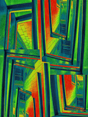
My abstract image was created digitally from one of my photos, so it is both an Abstract Photo and Digital Art.

SCROLL DOWN to see a tip for replacing colors in Photoshop (near the bottom of this post.)

Find links to three free online photo-editing sites.

Also find tips for saving photos in various versions.
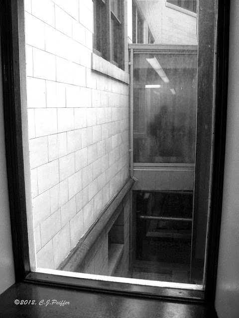

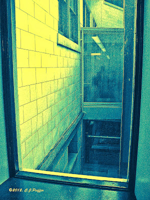
"Library Windows"
This photo was taken from the stacks in the main
branch of the Carnegie Library of Pittsburgh.
Looking through the window, I could see other windows
in other parts of the library.  Including the one I was
shooting the photo through, I count parts of ten
different windows.  I thought it made for an interesting
abstract design in and of itself, but then I used this
photo to create another abstract (below.)
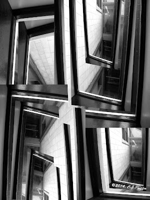
"Distorted Windows"
(black & white version)
I copied the above photo several
times, then I rotated and scaled
each image to fill the space.
Then I copied each image once or
twice, making each smaller to
fit over the image under it.
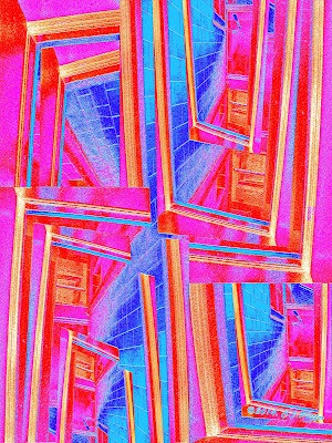
"Distorted Windows"
(colored and enhanced)
I upped the shadows/highlights in the medium range so the
stone blocks on the side of the building would be more
apparent. I then used bas relief to add texture and depth.

I chose the very darkest areas , then filled them
with red on a new layer. I made the red transparent so
there was a hint of red in the  black areas. 

I chose medium tones & filled them with a warm tan on a
new layer in color mode and did the same for the lightest
areas with yellow orange.

Color mode doesn't work well with black or white,
so the lightest areas remained white and I had to use
a transparent normal mode (in red) over the black
rather than a color mode layer.
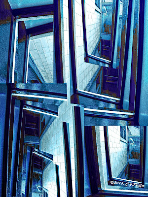
"Distorted Windows"
(blue version)
When you have your various
colors on different layers, it's
easy to replace them with
other colors. (See instructions.)

Scroll down for more versions.


PHOTOSHOP TIP - REPLACING COLORS 
There are several ways to replace colors in Photoshop.

First I made this version.  When I wanted to change colors to make different versions, I did this:

In this case, because I made separate layers for the red, tan and yellow orange, it was easy to do it this way:

 I went to the red layer and hit control and A (command and A on a Mac.)  That selected everything in that layer, but I only wanted to select the red parts, so I hit the up arrow once to select only the red, but that also nudged the red up a notch, so I hit the down arrow once to put it back into its original place.


I filled the selected areas with a royal blue on that same layer to replace the red.
An easy short cut for filling a selected area is to hold the shift key and hit F5. (Make sure you have already selected the color you want.)

I did the same for my tan and yellow-orange layers.

It took less than a minute to create a new color scheme using three shades of blue.

FREE ONLINE PHOTO-EDITING SITES:
I wanted to see what I could do on several free online photo editing sites.  I tried Fotor, PicMonkey and Pixlr.  I liked Pixlr best because many of its actions have names similar to the ones I am familiar with on Photoshop.  With a click of the mouse (or 2 or 3) I was able to create the images below. I used my original photo for one and the design I created from it for the other two.

If you don't already have or use photo-editing software, you may want to try all three to decide which one you like best. It is possible that there are actions you can do on one site that aren't available on the others, so you might want to use all three for different effects.

I suggest trying the three I mention above. (Some have basic free actions and then you have to pay if you want to use more sophisticated tools.)  Or search for other free online software.

Note: if you save your image on Pixlr, it saves to the Pixlr site. If you click the X in the upper right, it asks if you want to save your image before exiting and then you can choose a title and location to save it to your computer.

SEE IMAGES CREATED WITH PIXLR BELOW.

SAVING SEVERAL VERSIONS OF THE SAME PHOTO:
When saving any version of your original photo, keep the photo number in the title.  I don't use the letters that identify the camera in my title (such as DSCF or DSCN.) Because I have had several cameras over the years, it's possible that two different photos will include the same number, but I can easily determine which is the correct one.

Today I was searching for a photo I knew I had enhanced, but couldn't find it because I couldn't remember the title I gave it.  So, I found the original, told my computer to find the number of that photo (the one the camera assigned) and discovered I had mistakenly placed the enhanced one in the wrong folder months ago.

For the photos in this post, I titled my original photo "LibraryWindows" but the abstract version is "Distorted Windows."  These are some of the titles I used:
DSCF4108.jpg (original photo) I always keep a copy in case I want to start over.
LibraryWindows4108.psd (enhanced photo in photoshop)
LibraryWindowsBW4108.psd (black and white version)
DistortedWindowsAbstract4108.psd
DistortedWindowsAbstractBlue4108.psd
Notice the one constant is the photo's number, 4108.

Besides the psd (Photoshop) versions, I always save a jpg version of each.
I recently began to save a second jpg in a smaller size ---big enough to see online, but too small for anyone to copy and make a good print. The word Blog at the end indicates it is the size for blog posts. (DistortedWindowsAbstract4108Blog.jpg)

That way, it is ready to post online sometime in the future when I won't have to create a special jpg version because it is already done.

Experimenting at pixlr.com

Wednesday, July 23, 2014

Abstract Photo - 7/23/14: "Screened In" 2 versions

NF Photography prompt: Abstract Photo

"SCREENED IN"

After an evening event at the Carnegie Museum of Art in Pittsburgh,
I noticed a new, large, screened structure behind the museum.  With lights on
inside the structure, which appeared to be a storage area for large equipment,
I liked the designs created by the dark lines, screens, and lights, so I snapped
a few photos.  I wondered why some of the structure (black pieces) were
closer together and why there was a diagonal piece and a very thin one with a
curved corner. But that made the design more interesting than if the black
lines had been the same width, all vertical and horizontal and evenly spaced. 

I decided this image made a great abstract without any
enhancement at all. But, of course, I decided to have a bit of fun with it.


"SCREENED IN #2"
á la Mondrian
Because of the geometric design created by black lines in the original photo,
I decided to make this image resemble a Mondrian painting using primary
colors, black and white.  After making the image more vertical and horizontal
with Photoshop's distort tool (to undistorted it) I created 4 new layers above
the original photo, one for each color and white. On the red, blue, and
yellow layers, I changed the mode from normal to color. I selected
the sections I wanted red and filled them with red and did the
same for blue and yellow.  I left the fourth layer in normal mode
and filled in the sections I wanted to be white, then made the layer
transparent enough to see some of the texture of the screen. Using color
mode doesn't allow very light or very dark areas to accept color, so for the
very lightest spots, I used 3 more normal mode layers for the primary
colors, colored each and then made them transparent so a hint of
color would be visible on those very light areas.

Monday, July 7, 2014

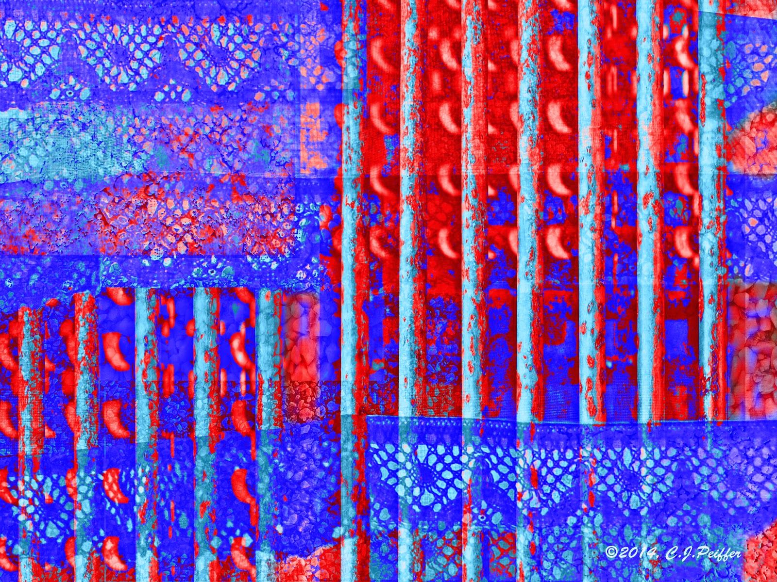
Abstract Photo and Summer of Color - Week of 7/7/14: "Barred WIndows"

NF Photography prompt: Abstract Photo
Beginning July 2nd, each week NF photo is alternating a prompt for Digital Art with a prompt for an Abstract Photo. Most of my digital art is also abstract, so many of my creations will work for both.


Scroll down for the Summer of Color version.
Week 5's colors are: Red, Royal Blue, and Light Blue.


I opened my file that holds photos of textures. The two main elements I chose were my kitchen curtains and a rusty old grate from a local park. Initially I chose a second photo of a different grate, but later decided not to use it.  I purposely chose images that I thought wouldn't go well together, to challenge myself to make them work in one abstract piece.

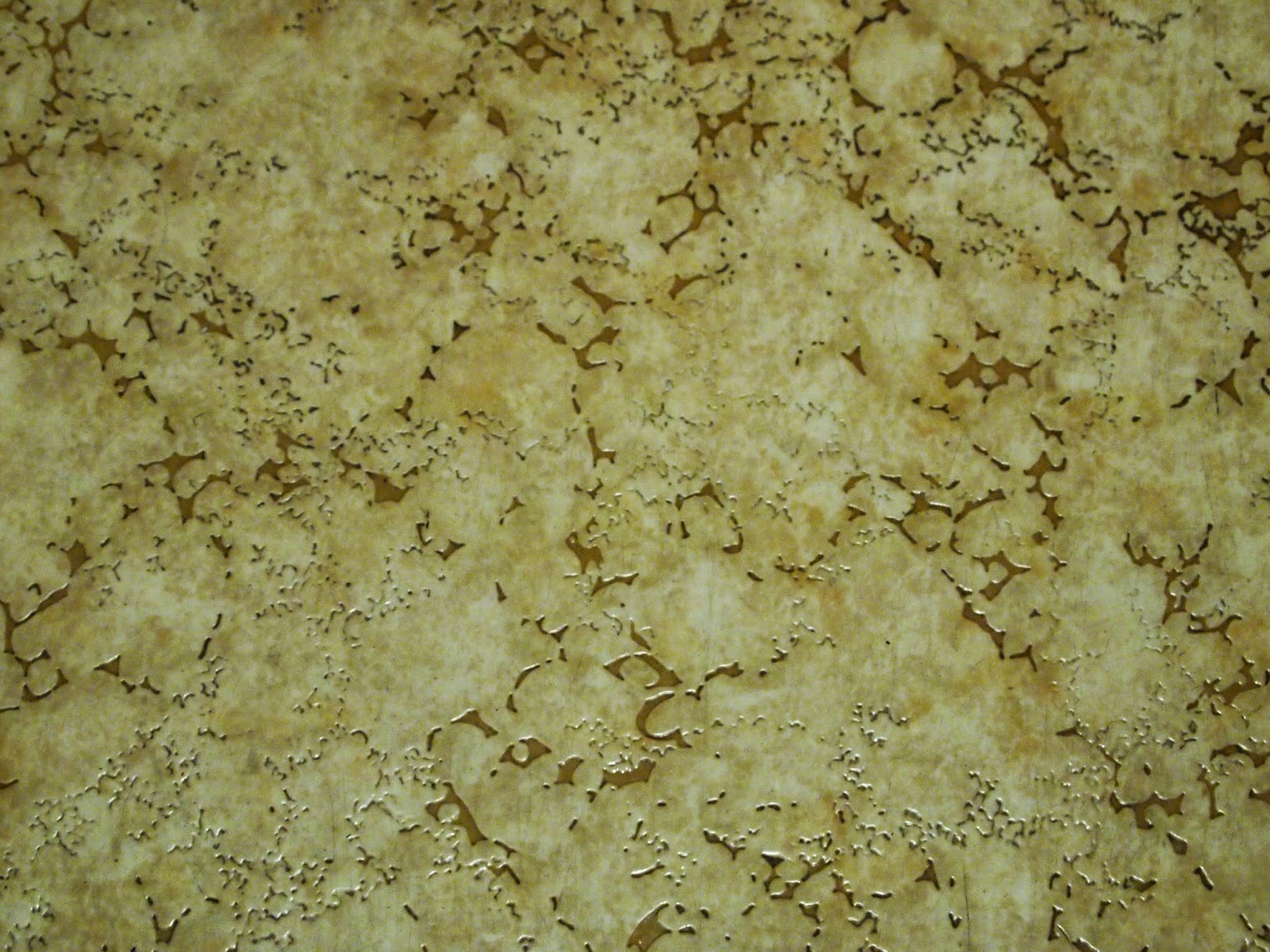
 I also wanted some background texture, so I chose 3 overall texture photos to add to the background. (I take lots of texture photos so I can use them in artistic pieces.) I made my main elements transparent enough that the textures show through, although in the final piece it is difficult or impossible to determine what they were originally.

"Barred Windows"
The first thing I did was use the distort tool in Photoshop to UN-distort the grate photo
to make the bars vertical. I upped the red saturation a little and created more contrast

with levels (because the photo lost some definition when I made it transparent.)
I basically kept the original colors: gray, ecru, orange, and rust.
There is one complete photo of the curtains (again transparent) but I also duplicated
just the lace and placed it in several locations. I added patches of 3 textures under
everything else.  If you look at the photos below, you will see what they were and be
able to identify them in this image, although I was using them for visual interest so

it doesn't matter what they are. I chose the title "Barred Windows" because the
only reason for bars and curtains to be together seemed to be on windows.
Summer of Color version:
Week 5 colors: Red, Royal Blue, Light Blue
My kitchen curtains and other photos
I used to create the above design.
Grate over storm drain at a local park, with
sunlight brightening some of the bars.
Linoleum
Asphalt parking lot
Small white gravel stones applied to
the outside wall of the municipal
building close to my home.

Tuesday, June 24, 2014

Abstract Photo & Summer of Color - Week of 6/23/14: "Homage to Geometry"

NF Photography asks us to post an Abstract Photo that already appears to be abstract or one that we have manipulated into an abstraction.

For six weeks beginning in June, Summer of Color gives us a color scheme to use in our art work. Week 3's colors are lavender, gray, and plum. SCROLL DOWN TO SEE MY SUMMER OF COLOR VERSION.

ABSTRACT ART
Abstract art can be representational (also referred to as objective abstraction) which includes images of recognizable/identifiable objects that are presented in a way that objects no longer look realistic. 

Non-representational (or non-objective) abstracts are not meant to represent any real objects. However, because of the nature of abstraction and the mind's desire to make sense of things, we often think they resemble certain objects. However, what one person sees in a non-representational abstraction may differ from what another sees in it. 

Even though I almost always begin creating my digital abstract images from my own photographs of real objects, sometimes I end up with a non-representational image and sometimes I end up with a representational one.  In my attempt to make this one non-representational, I turned the one recognizable thing ---the stairs ---sideways.


"Homage to Geometry"
In this image, I scaled, rotated, overlapped 
and/or changed colors on various parts.
I created a formal balance by making the left and right halves the
same, although the right is rotated 180º from the left.
(See original photo below.)
Summer of Color version
using Week 3's colors: lavender, gray and plum.
"Homage to Minimalism"
Original photo:
These stairs lead to the Scaife
Galleries at Pittsburgh's
Carnegie Museum of Art.

Monday, June 16, 2014

Abstract Photo and Summer of Color - Week of 6/16/14 "Carnival Lights"

NF Photography prompt: Abstract Photo

Scroll down for my Summer of Color version of this design.
This week's colors are Coral and Teal with a Smudge of White.

For anyone who thinks they aren't good at creating abstracts, I have created 3 easy lessons on creating successful abstract designs in any media.  If you are interested, you can find "Lesson 1: Color" by clicking HERE.   Lesson 1 has a link to "Lesson 2: UNITY" which has a link to "Lesson 3: ADDING VARIETY."  

"Carnival Lights"
I used the liquify tool in Photoshop to create zig-zag lines with the photo (below). 

Using a large brush, I dragged it up near the left, then moved a little to the
right and dragged it down, then up and down a few more times across the canvas.
Then I copied parts of that and pasted them into a new layer, rotated the layer

and lowered the opacity so the lower layer would show through ---then stretched
that layer horizontally to cover the layer below it. I kept essentially the same
colors as were in the original.
Summer of Color version
Besides changing colors, I manipulated the design slightly differently
and added textures that weren't in the design above.
For my smudge of white, I used a digital brush to create
smudges of white zig-zags across the page.
Original photo taken at a hot-air balloon
festival in New Castle, PA,
July 2012.
The balloon festival was a bust because of fog
and possible storms, but I took photos of closed
carnival booths and rides so it wouldn't
be a wasted 2-hour round trip.

Monday, June 9, 2014

Summer of Color and Abstract Photo "Sunset"

Summer of Color Challenge: We are given a color scheme and asked to create something with that scheme. This week the color scheme is aqua blue, yellow and hot pink.


NF Photography prompt: Abstract Photo
 
This is my creation for Summer of Color using this week's
color scheme and also for NF photography to create an abstract

from a photo. Below, find the abstracted image I
originally created and the photo that inspired both.
Although I didn't intend to do it, the aqua reminds me of
water in a Japanese woodcut print.

"SUNSET"
Original photo taken in April 2009
at Moraine State Park in PA.
I never liked this photo much but knew
I could do something with it.


Photoshop Tutorial: using embossing or bas relief filters 

If you've ever tried "embossing" or "bas relief" filters in Photoshop, you ended up with an ugly gray layer and may have wondered for what you could ever use those filters.

Try this:
After you have finalized your photo, enhanced the way you want, duplicate the layer. Make sure all layers are merged so that the filter will be applied to the entire image, unless you want to apply it to only one layer. I like to keep all the layers on my file saved in Photoshop, so I don't like to merge them.
(continued below photos)


I usually save my image as a Photoshop file so all layers are saved, then again as a jpg to merge all the layers. Then I open the jpg file, duplicate the layer and apply one of these filters to it, then add "embossed" or "bas relief" to the file name so I retain copies of my enhanced image before & after these filters are applied.

On the duplicate layer, change the mode (above the layers) from "normal" to "overlay."
Use either the Emboss filter (under Sketch) or the Bas relief (Filter Gallery under Stylize). Move the sliders up or down as desired.

If you choose Bas relief, set colors to black foreground and white background, unless you want to change the color of your image somewhat. On Bas relief, you will not be able to tell exactly how the image will look until after you hit OK. But you can always "undo" (or delete the Bas Relief layer) and try again.

If you choose to Emboss, make sure you have "Preview" checked so you can view what is happening to your image when you move the sliders ---you will be able to see what the finished photo will look like. When satisfied, hit OK.

(Note that with Emboss, the layer turns gray, but usually has bits of color in it.  When the layer is set at overlay, the image on the layer below it will show through after hitting OK.  Sometimes those bits of color look great, but sometimes they don't.  If you don't like them, make sure you are on the Emboss overlay layer, go to Color Saturation and move the Saturation slider all the way to the left.)

If you think the filter effect you achieved is too much on either Emboss or Bas Relief, change the opacity of the overlay layer until you find just the right amount for your image or go back and try again with different settings.

After you've completed your Embossed or Bas Relief layer, if you still want to make changes to your image with levels, color saturations, etc. You need to make them on the layer below the overlay layer.

Wednesday, June 4, 2014

Artistic Photo - 6/4/14 "Tropical Mix - Brazil"

NF Photography prompt: Abstract Photo


Photo Heart Connection
challenges us to choose a photo that was taken or worked on during the previous month (May) ---the one to which we have the strongest connection to our heart and soul. I served in the Peace Corps in Brazil right after college. There is something about Brazil that keeps me emotionally connected to the country. The Brazilian people were warm and welcoming to me then. I don't think a day has gone by in the 45 years since I returned home that I haven't thought about Brazil and the tiny, underdeveloped town where I served, and especially the wonderful people there. In 2011, I returned for the first time ---was greeted at the airport by about 25 of my friends and former students and treated like royalty for a week. When I started to work on this piece in May, I combined photos from one of my favorite places in Brazil ---Rio's botanical garden ---and a photo of one of my favorite tropical plants. I added lace because many women made handmade lace in the northeastern Brazilian town where I had lived and worked.  This is my first entry to Photo Heart Connection.


At Journal52, Chelle posts weekly themes for art journal entries. I just found out about it, so I am jumping in with this (already created) image because it fits themes for 2 weeks: Week 22 - Travel, and Week 23 - Passion. Four of my passions are photography, art, travel and Brazil.
"Tropical Mix - Brazil"
I used three photos to create this image.  I added lace because when I lived in Brazil (1967-69)
many older women in the small interior town where I served as a Peace Corps Volunteer

spent their days tatting.  I bought several yards of their handmade lace.
I still have a few scraps that I use occasionally in my art work. 


The Jardim Botânico of Rio de Janeiro has about 6,500 species of Brazilian and foreign flora on display over approximately 130 acres with additional land forming a park that totals 370 acres. Among its plants are 900 varieties of palm trees. It includes a research center and library housing over 32,000 volumes. It was founded in 1808 by King John VI of Portugal and was originally intended to grow spices that had to be imported from the West Indies. The garden was opened to the public in 1822 and is now open during daylight every day except Christmas and New Year's Day.

Botanical Garden, Rio de Janeiro, August 2011,
assorted palms near a lake.
Botanical Garden,
Rio de Janeiro, August 2011

I have no idea what this plant is.
Red Bromeliads and other plants
Phipps Conservatory, Pittsburgh
August 2012
I had taken several photos of Bromeliads in Brazil in 2011 and at the local conservatory in 2012, but didn't know much about them. Later I learned that they range in color from cream to yellow, orange, green and red. They aren't really flowers, but are colored leaves. They grow in tropical climates in cone shapes, some resembling the leaves of a pineapple to which they are related. Water collects in the cones to keep the plants hydrated through dry seasons. They perform a community service, too. Insects, birds, monkeys, and other forest animals use them as watering holes.

Although I didn't use this
photo for my abstract, it shows
the cone shape that can
collect water between leaves.

Bird Park near Iguaçu Falls
Brazil, August 2011