Showing posts with label "Summer of Color". Show all posts

Monday, July 14, 2014

Digital Art and Summer of Color - Week of 7/14/14: "IMPRESSION"

NF Photography prompt: Digital Art
NF photo alternates a prompt for a Digital Art creation with a prompt for an Abstract Photo on alternate Wednesdays.


Scroll down for the Summer of Color version:
Week 6's colors are:  Raspberry, Tangerine, Lemon


This is one of the pieces I originally created when I was first learning Photoshop, 25 years ago.  At that time I was experimenting with shapes, textures, gradients, and colors. Photoshop didn't even have layers then, so if I added something and then didn't like it, I could undo only that one step, but after that my change was permanent. (I ended up saving each image after each change and adding a new number at the end of the title.)

In 2001, I recreated it with a more sophisticated version of Photoshop when I needed a gift for a coworker named Mark.  When I'm trying to come up with a title, I often use my computer's thesaurus. When I entered "mark," one of the words that came up was "impression," so that became the title for Mark's gift. At that time I had found some great ink jet paper with a silver sparkly texture, almost like a holograph.  Some images didn't work well on it, but this one looked terrific, so I printed it on the special paper, matted and framed the image for my friend. (Unfortunately the paper is no longer being made, but I had purchased several packages of it and I still have some.)

I also promised Mark that I would never print another one just like his gift. His had only red, black, royal blue and gray in it. The sparkly paper had no ink on it where the image was white.

This image has been reworked numerous times over the years and I reworked it again for this Digital Art prompt and then reworked it again for Summer of Color.  Because I don't remember how many times it was reworked and I lost some of older files when a hard drive crashed, I chose to add a X  and XI for version 10 and 11.

SEE INFO BELOW THE IMAGES FOR A SPECIAL DEAL ON PHOTOSHOP CC, THE LATEST VERSION, PLUS LIGHTROOM.

"Impression X"
Created completely in Photoshop.
"Impression XI"
Summer of Color version: essentially
the same design with color changes, but
I changed a few design elements, too.
Raspberry, Tangerine, & Lemon are the colors
for this final week of this year's S.O.C. meme.

ON SALE:  Photoshop CC and Lightroom for $9.99/month, plus local taxes (regular price is $19.99/month for Photoshop only.) You can set up an automatic monthly payment to a credit card. Requires a one-year commitment. Because it is a subscription, you will receive automatic updates.

To put this in perspective, a new version of Photoshop CS6 costs $699.00, so it would take 5.75 years paying $9.99 each month to match that and wouldn't include automatic updates nor Lightroom. You can try it first with a 30-day free trial.

For more info or to download a trial of each program:
https://creative.adobe.com/plans/photography?trackingid=KMAZI

I can't find info on how long this sale will last. (Last year the sale began the day after Thanksgiving and ended on Dec 31st.) I got mine during last year's sale and was told by the representative that as long as I keep the subscription, the price will not rise. That, of course, may change.

Note: Even though the CC stands for Creative Cloud, you will download the program to your computer, therefore if you are on a computer at work or a library, you will not have access. I think you can add it to 2 devices (desktop computer, laptop, iPad, iPhone) for this price.

You can download it immediately and start to use it right away.

Monday, July 7, 2014

Abstract Photo and Summer of Color - Week of 7/7/14: "Barred WIndows"

NF Photography prompt: Abstract Photo
Beginning July 2nd, each week NF photo is alternating a prompt for Digital Art with a prompt for an Abstract Photo. Most of my digital art is also abstract, so many of my creations will work for both.


Scroll down for the Summer of Color version.
Week 5's colors are: Red, Royal Blue, and Light Blue.


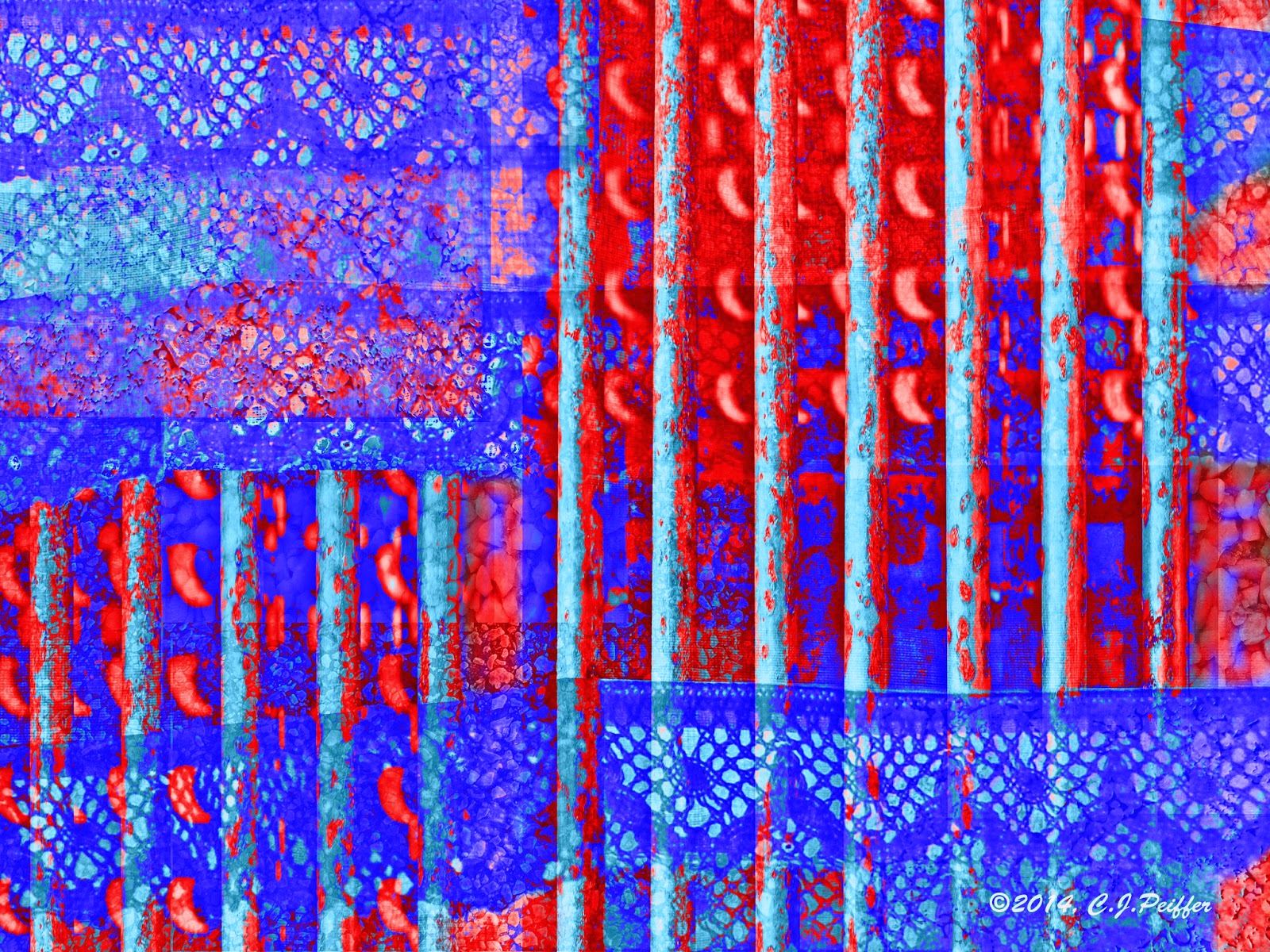
I opened my file that holds photos of textures. The two main elements I chose were my kitchen curtains and a rusty old grate from a local park. Initially I chose a second photo of a different grate, but later decided not to use it.  I purposely chose images that I thought wouldn't go well together, to challenge myself to make them work in one abstract piece.

 I also wanted some background texture, so I chose 3 overall texture photos to add to the background. (I take lots of texture photos so I can use them in artistic pieces.) I made my main elements transparent enough that the textures show through, although in the final piece it is difficult or impossible to determine what they were originally.

"Barred Windows"
The first thing I did was use the distort tool in Photoshop to UN-distort the grate photo
to make the bars vertical. I upped the red saturation a little and created more contrast

with levels (because the photo lost some definition when I made it transparent.)
I basically kept the original colors: gray, ecru, orange, and rust.
There is one complete photo of the curtains (again transparent) but I also duplicated
just the lace and placed it in several locations. I added patches of 3 textures under
everything else.  If you look at the photos below, you will see what they were and be
able to identify them in this image, although I was using them for visual interest so

it doesn't matter what they are. I chose the title "Barred Windows" because the
only reason for bars and curtains to be together seemed to be on windows.
Summer of Color version:
Week 5 colors: Red, Royal Blue, Light Blue
My kitchen curtains and other photos
I used to create the above design.
Grate over storm drain at a local park, with
sunlight brightening some of the bars.
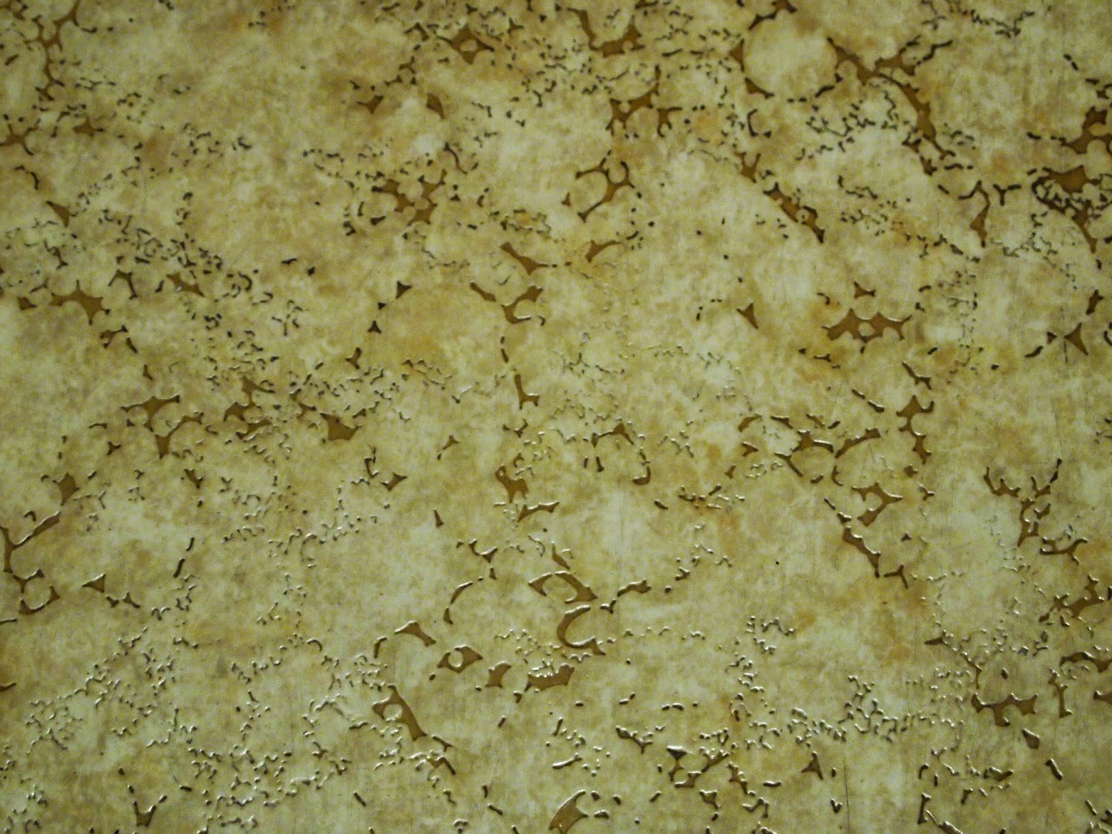
Linoleum
Asphalt parking lot
Small white gravel stones applied to
the outside wall of the municipal
building close to my home.

Friday, June 27, 2014

Kitty Par-TAY, Digital Art, Summer of Color - 6/27 to 7/2/14: "Tuxedo Cat"

I am joining the following memes with my "Tuxedo Cat" image:

Kitty Par-TAY ---a place to submit cat art (or other art) each Friday.

Caterday Art asks you to edit one of your cat photos to make it artistic. I didn't start with a photo. I designed this cat myself to look like folk art and donated cards and prints to a homeless cat organization.

For six weeks this summer, Summer of Color gives us three colors to use in a piece of art work.
The colors for Week 4 are: pink, apple green and dark green.
SCROLL DOWN TO VIEW MY SUMMER OF COLOR VERSION.


NF Photo: DIGITAL ART
NF Photography has been having an Abstract Photo prompt each Wednesday. Beginning on July 2nd the promo will be for a Digital Art creation alternating each week with an Abstract Photo prompt.


Cat Art
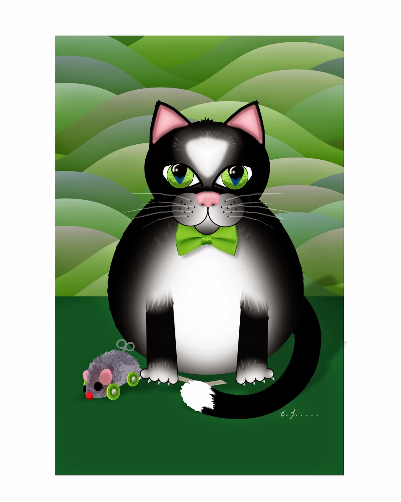
Considering that my husband and I have had a number of cats over the years, I haven't produced much cat art.  But recently a friend who volunteers at a non-profit that spays and neuters stray cats asked me to donate to a benefit auction.  I could have donated anything ---it didn't have to be cat-related. However, I decided to design blank cat greeting cards and small matted prints featuring a fat tuxedo cat with a toy mouse.
"Tuxedo Cat in Green"
I wanted these to look like folk art.
I created them digitally using Photoshop.

It took about 20 hours to create this one
and about 15 minutes to change to each
color for other versions. The Summer of
Color took even longer.(See below for the same design
in other colors.)

Click on any image for a larger view of all.

My husband's mother worked for the Humane Society so his family always had a cat and a dog. My family had never had cats, only dogs, but when I bought a house  in 1978, I adopted a cat and soon had three. Two were gray and white, one short and one long-haired. The only female was a gray tabby.

When I met my husband in 1984, he had no pets because he lived in an apartment.

Three years later, on my summer break a tortoise-shell kitten crawled from under my car and came right up to me. We didnt feed her at first, but she stayed in our yard, so then we had four.

Two of them died over the years and then an older calico showed up with an all-white male kitten.  A few weeks later, she had a litter of four, so for a while we had eight total.  We found homes for three kittens and kept one, a long-haired calico female. We had the older calico spayed so we would have no more "surprises." As the years went on, several died and then a tuxedo cat adopted us. (Stray cats must sense that we are suckers for furry faces.) She was actually quite small, not fat like the one in my illustration.  It was sad when we finally lost her. She and my husband had a special bond, but we both miss her terribly.

By that time we were retired and wanted to travel.  Previously a friend took care of our cats when we traveled (not often) and I would walk her dog and feed and play with her cats when she was away.  But she had moved three states away and we had no one to take care of our very-spoiled cats.  So when the tuxedo cat had an inoperable tumor on her back that eventually affected her to the point she could no longer walk, we sent her to the great litter box in the sky and decided not to adopt more cats, at least for a while.

We know that once we are too old and decrepit to travel, we will probably adopt two from an animal shelter.  My husband isn't a people-person, but he absolutely loves animals.  He is a cat magnet. Strange cats go right up to him ---so they certainly must love him back.

SUMMER OF COLOR VERSION
I never saw a greenish cat
I never hope to see one,
But I can surely tell you that,
I'd rather see than be one.
(With apologies to Gelett Burgess who
wrote the famous purple cow poem.)
"Tuxedo Cat in Orange"
"Tuxedo Cat in Turquoise"
Click on any image foe
a larger view of all.
"Tuxedo Cat in Purple"

"Tuxedo Cat in Blue"
I created these in various
colors so I could package
cards in several color
combinations and so
that matted prints could
be selected by buyers to
match room decor.
"Tuxedo Cat in Gold"
"Tuxedo Cat in Red"
"Tuxedo Cat in Pink"
 
Cards are available with a larger face
as in this card.

Cards are available with an entire cat
including mouse toy as in this card.


 If you are interested in buying a set of 4 blank cards or a matted print:
All proceeds to be donated to The Homeless Cat Management Team (I donate my time and materials.)
Your check will be made out to that organization, so it will be tax deductible.

1. Leave a comment that begins with "DO NOT PUBLISH." (I monitor my comments, so I won't publish it.)

If you wish, you may also leave an additional comment about the post that will be published. In that case, please submit 2 comments, one for purchasing items and one for a general comment, not just one.

2. Include your email address and I will get back to you with information on where to send your check.

3. Specify your interest in the items listed below.

Prices include postage within the U.S.  If you want an item shipped elsewhere there will be an additional postage charge.

• 4 blank cards, full body with mouse toy (folded to 5.5" X 8.5") +4 envelopes (assorted colors to be chosen by us from what is available): $7.50

• 4 blank cards, larger face (folded to 5.5" X 8.5") +4 envelopes (assorted colors to be chosen by us from what is available): $7.50

• 5"X 7" matted print, $7.50,  specify color of print you prefer - mat will be either white or black depending on what we have available and will fit a standard 5" X 7" frame

• 8"X 10" matted print, $9.00, specify color of print you prefer - mat will be either white or black depending on what we have available and will fit a standard 8" X 10" frame

Note: Because of the mats, the outside edges of a print will be covered so it will appear to be slightly smaller than what you see above. Prints include the entire cat with mouse toy.

Prints are available in these colors: blue, gold, green, orange, pink, purple, red, turquoise and the special Summer of Color combination of: pink, apple green, and dark green.

Tuesday, June 24, 2014

Abstract Photo & Summer of Color - Week of 6/23/14: "Homage to Geometry"

NF Photography asks us to post an Abstract Photo that already appears to be abstract or one that we have manipulated into an abstraction.

For six weeks beginning in June, Summer of Color gives us a color scheme to use in our art work. Week 3's colors are lavender, gray, and plum. SCROLL DOWN TO SEE MY SUMMER OF COLOR VERSION.

ABSTRACT ART
Abstract art can be representational (also referred to as objective abstraction) which includes images of recognizable/identifiable objects that are presented in a way that objects no longer look realistic. 

Non-representational (or non-objective) abstracts are not meant to represent any real objects. However, because of the nature of abstraction and the mind's desire to make sense of things, we often think they resemble certain objects. However, what one person sees in a non-representational abstraction may differ from what another sees in it. 

Even though I almost always begin creating my digital abstract images from my own photographs of real objects, sometimes I end up with a non-representational image and sometimes I end up with a representational one.  In my attempt to make this one non-representational, I turned the one recognizable thing ---the stairs ---sideways.


"Homage to Geometry"
In this image, I scaled, rotated, overlapped 
and/or changed colors on various parts.
I created a formal balance by making the left and right halves the
same, although the right is rotated 180º from the left.
(See original photo below.)
Summer of Color version
using Week 3's colors: lavender, gray and plum.
"Homage to Minimalism"
Original photo:
These stairs lead to the Scaife
Galleries at Pittsburgh's
Carnegie Museum of Art.

Monday, June 16, 2014

Abstract Photo and Summer of Color - Week of 6/16/14 "Carnival Lights"

NF Photography prompt: Abstract Photo

Scroll down for my Summer of Color version of this design.
This week's colors are Coral and Teal with a Smudge of White.

For anyone who thinks they aren't good at creating abstracts, I have created 3 easy lessons on creating successful abstract designs in any media.  If you are interested, you can find "Lesson 1: Color" by clicking HERE.   Lesson 1 has a link to "Lesson 2: UNITY" which has a link to "Lesson 3: ADDING VARIETY."  

"Carnival Lights"
I used the liquify tool in Photoshop to create zig-zag lines with the photo (below). 

Using a large brush, I dragged it up near the left, then moved a little to the
right and dragged it down, then up and down a few more times across the canvas.
Then I copied parts of that and pasted them into a new layer, rotated the layer

and lowered the opacity so the lower layer would show through ---then stretched
that layer horizontally to cover the layer below it. I kept essentially the same
colors as were in the original.
Summer of Color version
Besides changing colors, I manipulated the design slightly differently
and added textures that weren't in the design above.
For my smudge of white, I used a digital brush to create
smudges of white zig-zags across the page.
Original photo taken at a hot-air balloon
festival in New Castle, PA,
July 2012.
The balloon festival was a bust because of fog
and possible storms, but I took photos of closed
carnival booths and rides so it wouldn't
be a wasted 2-hour round trip.

Monday, June 9, 2014

Summer of Color and Abstract Photo "Sunset"

Summer of Color Challenge: We are given a color scheme and asked to create something with that scheme. This week the color scheme is aqua blue, yellow and hot pink.


NF Photography prompt: Abstract Photo
 
This is my creation for Summer of Color using this week's
color scheme and also for NF photography to create an abstract

from a photo. Below, find the abstracted image I
originally created and the photo that inspired both.
Although I didn't intend to do it, the aqua reminds me of
water in a Japanese woodcut print.

"SUNSET"
Original photo taken in April 2009
at Moraine State Park in PA.
I never liked this photo much but knew
I could do something with it.


Photoshop Tutorial: using embossing or bas relief filters 

If you've ever tried "embossing" or "bas relief" filters in Photoshop, you ended up with an ugly gray layer and may have wondered for what you could ever use those filters.

Try this:
After you have finalized your photo, enhanced the way you want, duplicate the layer. Make sure all layers are merged so that the filter will be applied to the entire image, unless you want to apply it to only one layer. I like to keep all the layers on my file saved in Photoshop, so I don't like to merge them.
(continued below photos)


I usually save my image as a Photoshop file so all layers are saved, then again as a jpg to merge all the layers. Then I open the jpg file, duplicate the layer and apply one of these filters to it, then add "embossed" or "bas relief" to the file name so I retain copies of my enhanced image before & after these filters are applied.

On the duplicate layer, change the mode (above the layers) from "normal" to "overlay."
Use either the Emboss filter (under Sketch) or the Bas relief (Filter Gallery under Stylize). Move the sliders up or down as desired.

If you choose Bas relief, set colors to black foreground and white background, unless you want to change the color of your image somewhat. On Bas relief, you will not be able to tell exactly how the image will look until after you hit OK. But you can always "undo" (or delete the Bas Relief layer) and try again.

If you choose to Emboss, make sure you have "Preview" checked so you can view what is happening to your image when you move the sliders ---you will be able to see what the finished photo will look like. When satisfied, hit OK.

(Note that with Emboss, the layer turns gray, but usually has bits of color in it.  When the layer is set at overlay, the image on the layer below it will show through after hitting OK.  Sometimes those bits of color look great, but sometimes they don't.  If you don't like them, make sure you are on the Emboss overlay layer, go to Color Saturation and move the Saturation slider all the way to the left.)

If you think the filter effect you achieved is too much on either Emboss or Bas Relief, change the opacity of the overlay layer until you find just the right amount for your image or go back and try again with different settings.

After you've completed your Embossed or Bas Relief layer, if you still want to make changes to your image with levels, color saturations, etc. You need to make them on the layer below the overlay layer.